I was wondering if anyone wants to pay me to do their website for them using Canvas Control Library without being physically present i.e. telecommuting wise if so please send me an email to akshay.srin@gmail.com with an offer.
I would like to dedicate this invention of mine in memory of the hero John Galt from the novel Atlas Shrugged by Ayn Rand. Read it and understand what happened and is happening to America and the world it controls

.
Changes to article that caused this new version:
Since the article is very long as it documents the entire system of Canvas Control Library I will use this section to describe what has changed in the article from the last version to this current one so you do not have to go through the entire article again. Towards that end here are the changes:
- Fixed partial fills of complex shapes for voting control. When doing partial fills with voting control make sure images are small for good response in drawing the voting control.
- When using stroke() on a line the final result is dithered lines this was causing the fill of the star which does not use an outline image as it is drawn on the canvas in javascript code to look bad like it wasnt being filled properly. So I now use a custom line drawing algorithm which will draw a solid outline undithered and the fill is now complete. However some lines do not look good straight. So what I suggest is that you always use the custom outline image and provide one of the star of your choice which will fill perfectly. I have provided examples and an outline image of a star in the package.
- Added voting control with partial fills for any complex outline shape image or standard star provided.
- BoundaryFillableMap control now supports partial fills horizontally or vertically.
- New control SimpleXMLViewer control and various code fixes as I am in the process of stabilizing all controls removing bugs etc.
- Treeview control is finally completely fixed and is available for use. Fixes to drawing and scrolling done. Scrollbar modified to allow for custom functions for incrementing, decrementing and mouse move based scrolling.
- New control
BoundaryFillableMap. In essence you see those map controls with certain countries painted in colors where the base image is just an outline map of the countries and can be changed dynamically to any color. Well this control does that.
- Latest update is to treeview control as when I went to use it in production the algorithm I used was too unwieldy. Now it uses objects. However the postback system only supported passing strings, numbers and arrays only. So I have modified the entire postback system all 4 stages to support passing objects i.e. var obj = { Test: 10, Test2: 20} types.
- There will be continuous tweaks now for the latest please download from here.
- Latest changes are to ComboBox, Treeview controls and a simple new system to pass custom strings and numbers in an array from the client side to the server side which is unwrapped and available in C# as InputParams ArrayList in old way of doing things you would use a hidden field to pass information back to the server.
- New control splitter control.
- Additionally if you need any basic new controls leave me a note at the end and vote and also you can email me at akshay.srin@gmail.com.
Table of Contents
Currently if you want to use controls like Button or ComboBox in HTML5 you have the HTML5 elements to use and place on your web page. These controls that come free with HTML5 are limited in the extent to which they can be made fancy or as in ComboBox if you wanted the text and dropdown list to contain images for backgrounds or complex controls you would find this to be quite hard. Another new element that has been introduced in HTML5 is the canvas element. This element allows for drawing whatever you want on it using JavaScript. The current situation though is there are no controls you can use that are available that are purely based on the canvas. To plug this gap I have created a Canvas Control Library with all the common controls and advanced ones like TreeView which due to the nature of canvas allow for great control over the graphical presentation of the controls and their item contents. So in the case of the ComboBox example with my Canvas Control Libraries ComboBox adding images to the background of the text area and list drop down is quite easy. Also animated graphing and charting controls have been ported to first class Canvas Control Library controls.
Besides the screenshots in this article I am hosting the
ASP.NET based example web pages and the
PHP example running on Apache and a
PHP example running on IIS. You can check the new system out fully functional on any major browser. Also as there is constant new additions will now also tweet the changes on
Twitter. Have created a
Facebook page for the system. So if you like the system are evaluating it or using it follow me on Twitter and like and watch the Facebook page alternatively or as well.
The main example is the FormsBased.aspx (
ASP.NET/
PHP on Apache/
PHP on IIS/PHP on Ubuntu Linux) if you look at this you will notice the following differences between this new system of mine and the current normal old way of doing web pages with form user input requiring server postbacks and showing the new results on the client:
- You do not move away from the page it acts like a Windows Application.
- It has better usability the user can input information and get back information after the server has processed it in a quicker fashion that is more like the usability experience of a Windows WPF application.
- Since you aren't downloading whole web pages over and over as you click your way to booking a ticket in the example its faster and more responsive to the user. So performance gains in other words.
- The final seller is you are free of the limitations graphics presentation looks wise that you will be if you use regular HTML5 controls to build your forms based websites pages even if you are the best CSS3 skinner on the planet. So you can provide the best look and feel and the only limit is your artistic imagination not the technology which has been the limit so far.
The code for the JavaScript is downloadable from GitHub repository link for
Canvas Control Library . Examples for ASP.NET are available currently in the same GitHub repository.
 Label Control :
The simplest element is Label control and to add a label to your canvas you would make the following JavaScript call from your web page after the canvas element on which you mean to draw the label as follows:
 Collapse | Copy Code
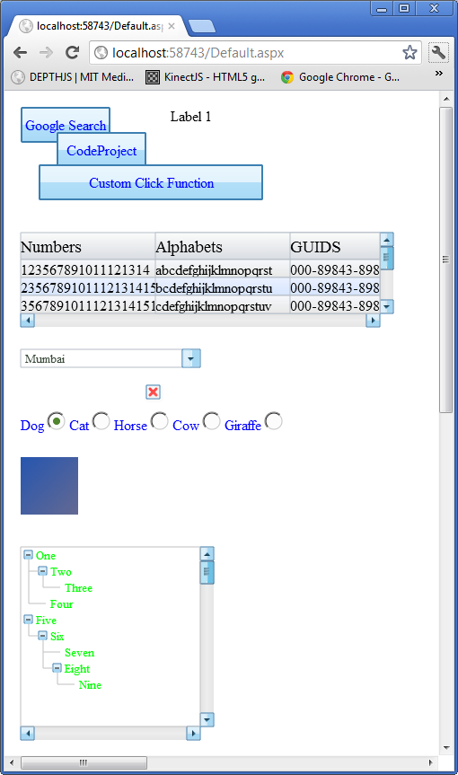
createLabel(elemId, 'l1', 150, 10, 100, 20, 'Label 1', '#000000', 12, '12pt Ariel', null, highestDepth);
The basic function call for creating a label is:
Collapse | Copy Code
function createLabel(canvasid, controlNameId, x, y, width, height, text,
  textColor, textHeight, textFontString, drawFunction, depth, alignment, clickFunction,
  backgroundColor, autoAdjustWidth, tag, isHyperlink, url, nobrowserhistory, isnewbrowserwindow,
  nameofnewbrowserwindow, widthofnewbrowserwindow, heightofnewbrowserwindow, newbrowserwindowisresizable,
  newbrowserwindowhasscrollbars, newbrowserwindowhastoolbar, newbrowserwindowhaslocationorurloraddressbox,
  newbroserwindowhasdirectoriesorextrabuttons, newbrowserwindowhasstatusbar,
  newbrowserwindowhasmenubar, newbrowserwindowcopyhistory)
So what this means is that the id of the canvas for example "canvas1" is passed in which is the canvas on which you want to draw is the first parameter to the function call. The second and third parameters x, y is the point location of the top left corner of the label you want to draw at on the canvas. The width and the height of the label. The text parameter is the text you want to display for the label in this case the label when drawn will display text Label 1 at location 150, 50 on the canvas1 canvas. The
textColor is the color of the text you want drawn. The
textHeight is essentially the same as the
textFontString font point value which in this case is 12 as we are using 12 point Ariel font for drawing the label text. The
drawFunction is an override so that if you wanted to draw something custom you could supply your own JavaScript canvas drawing code to draw the label in any custom way you like. The depth value is the layer on which the control will be drawn and normally you want to use the
highestDepth variable value which is defined and maintained in the Canvas Control Libraries internal JavaScript code. You can also make the label into a hyperlink and supply the parameters. Look at button examples which provide using the extra hyperlink parameters.
Button Control:
To add a button to your canvas you would make the following JavaScript call from your web page after the canvas element on which you mean to draw the button as follows:
Collapse | Copy Code
createButton(elemId, 'b1', 10, 10, 100, 30, 'Google Search', '#0000FF', 12,
  '12pt Ariel', 5, highestDepth, 1, 0, null, null, '#bee6fd', '#a7d9f5',
  '#eaf6fd', '#d9f0fc', '#3c7fb1', null, 1, 'http://www.google.com');
Collapse | Copy Code
createButton(elemId, 'b2', 50, 38, 100, 40, 'CodeProject', '#0000FF',
  12, '12pt Ariel', 10, highestDepth + 1, 1, 1, null, null, '#bee6fd', '#a7d9f5', '#eaf6fd',
  '#d9f0fc', '#3c7fb1', null, 1, 'http://www.codeproject.com', 0, 1, 'CodeProject',
  '600', '400', 'no', 'no', 'no', 'no', 'no', 'no', 'no', 'no');
Collapse | Copy Code
createButton(elemId, 'b8', 500, 74, 250, 56, 'Custom Click Function', '#0000FF',
  12, '12pt Ariel', 7, highestDepth + 1, 2, 1,
  function (canvasid, windowid) { invokeServerSideFunction('AjaxEx1.aspx',
  'ClickMe', elemId, windowid, function () { alert('Did Postback'); }); },
  null, '#bee6fd', '#a7d9f5', '#eaf6fd', '#d9f0fc', '#3c7fb1');
The basic function call for creating a button is:
Collapse | Copy Code
createButton(canvasid, controlNameId, x, y, width, height, text, textColor,
  textHeight, textFontString, edgeRadius, depth, theme, hasgloss, clickFunction, drawFunction,
  bottomColorStart, bottomColorEnd, topColorStart, topColorEnd, borderColor, tag, isHyperlink,
  url, nobrowserhistory, isnewbrowserwindow,    nameofnewbrowserwindow, widthofnewbrowserwindow,
  heightofnewbrowserwindow, newbrowserwindowisresizable,
  newbrowserwindowhasscrollbars, newbrowserwindowhastoolbar,
  newbrowserwindowhaslocationorurloraddressbox, newbroserwindowhasdirectoriesorextrabuttons,
  newbrowserwindowhasstatusbar, newbrowserwindowhasmenubar, newbrowserwindowcopyhistory)
The first example will draw a button on canvas1 at 10, 10 with a width of 100 pixels and a height of 40 pixels with blue 12 pt Ariel font button label text Google Search. The only new thing is that when you click the button you go the URL provided www.google.com. We do not provide a custom drawing JavaScript function so we set the
drawFunction parameter to null. The parameters bottomColorStart, bottomColorEnd, topColorStart and topColorEnd define the bottom half gradient and top half gradient of the background of the button. The borderColor parameter draws the border line in that color. When isnewbrowserwindow is set to 1 as in the second example you provide all the parameters to customize the new browser window to display the URL in the case of second example www.codeproject.com. In the third example you don't use hyperlinks so you don't provide any of those parameters and just provide a custom javascript click function to do custom logic in the case of the example it pops up an alert box.
Themes the beautification begins with 2 themes for buttons 1 & 2 with gloss and the screenshot for theme 1 is shown below:

The screenshot for theme 2 is shown below which is a more complex theme:
 Grid/ListBox Control :
To add a grid to your canvas you would make the following JavaScript call from your web page after the canvas element on which you mean to draw the grid as follows:
Collapse | Copy Code
createGrid(elemId, 'g1', 10, 150, 400, 90, highestDepth,
  [['123567891011121314', 'abcdefghijklmnopqrst', '000-89843-8983459'], ['2356789101112131415',
  'bcdefghijklmnopqrstu', '000-89843-8983459'], ['35678910111213141516', 'cdefghijklmnopqrstuv',
  '000-89843-8983459'], ['45678910111213141516', 'defghijklmnopqrstuv', '000-89843-8983459'],
  ['5678910111213141516', 'efghijklmnopqrstuv', '000-89843-8983459'], ['678910111213141516',
  'fghijklmnopqrstuv', '000-89843-8983459']], ['Numbers', 'Alphabets', 'GUIDS'], '#000000', 12,
  '12pt Ariel', '#000000', 14, '14pt Ariel', null, null, function (canvasid, windowid, c, r) {
  alert('you clicked cell number ' + c + ' at row number ' + r); }, 20, 30, [150, 150, 200], 1,
  '#b7bfc8', 1, '#fbfbfb', '#d9dde1', '#f6f8fb', '#e7e7e7', '#eaf1ff', '#d7e5ff');
The basic function call for creating a grid is:
Collapse | Copy Code
createGrid(canvasid, controlNameId, x, y, width, height, depth, rowData,
    headerData, rowDataTextColor, rowDataTextHeight, rowDataTextFontString, headerDataTextColor,
    headerDataTextHeight, headerDataTextFontString, drawRowDataCellFunction, drawHeaderCellFunction,
    cellClickFunction, dataRowHeight, headerRowHeight, columnWidthArray, hasBorder, borderColor,
    borderLineWidth, headerbackgroundstartcolor, headerbackgroundendcolor, altrowbgcolorstart1,
    altrowbgcolorend1, altrowbgcolorstart2, altrowbgcolorend2, tag)
In the
createGrid function one of the new parameters is
rowData which is simply an array which contains an array for each row which contains the cell text to draw for each cell. The next array
headerData is an array containing the header cell text to draw for each header row. One of the advantages is that the header row stays put on scrolling the contents of the grid and only the rowData contents rows and cells that is scroll. You can custom draw the cell contents by passing in a JavaScript function which draws them for the
drawRowDataCellFunction which in the examples case we use the default drawing method supplied by passing in null. You can do the same for drawing the header cells which in the examples case is null so default drawing method will be used. I have supplied a
cellClickFunction which simply pops up a message box informing you which cell at which row you clicked on the grid but you can change this of course to do whatever complex business or game logic you need. The
dataRowHeight is the height of each row which has to be uniform and fixed and in the example is set to 20 pixels. Same for the header row height which is set to 30 pixels. The
columnWidthArray allows you to pass in an array containing the width's of all the columns in your grid. The rest of the three parameters concern how to draw the border of the grid. The last 6 parameters are all used to gradient paint the header and alternate row backgrounds.
In the case of a ListBox all you have to do is create a grid with only 1 column. That is why I have not provided a separate control for ListBox.
ComboBox Control
To add a ComboBox to your canvas you would make the following JavaScript call from your web page after the canvas element on which you mean to draw the ComboBox as follows:
Collapse | Copy Code
createComboBox(elemId, 'cb1', 10, 280, 200, 20, highestDepth, ['Mumbai','Pune','Juhu',
  'Phoenix','London','New York','San Fransisco','Los Angeles','Houston','Boston'], null, null,
  null, null, null, '#364635', 10, '10pt Ariel', '#1b213b', 10, '10pt Ariel');
The basic function call for create ComboBox is:
Collapse | Copy Code
createComboBox(canvasid, controlNameId, x, y, width, height, depth, data,
  drawTextAreaFunction, drawButtonFunction, drawListAreaFunction, buttonClickFunction,
  listAreaClickFunction, textAreaTextColor, textAreaTextHeight, textAreaFontString, listAreaTextColor,
  listAreaTextHeight, listAreaFontString, onSelectionChanged, tag)
The data parameter is an array containing the list of strings to display in the dropdown list area. Some of the new parameters here are
drawTextAreaFunction,
drawButtonFunction,
drawListAreaFunction which are all passed in as null in the example using default drawing capabilities. You can override these to completely customize the drawing of the ComboBox.
CheckBox Control
To add a CheckBox to your canvas you would make the following JavaScript call from your web page after the canvas element on which you mean to draw the CheckBox as follows:
Collapse | Copy Code
createCheckbox(elemId, 'chk1', 150, 320, highestDepth, 0);
The basic function call for creating a CheckBox is:
Collapse | Copy Code
createCheckbox(canvasid, controlNameId, x, y, depth, status, tag)
In this case the new parameter is status which is 1 for checked and 0 for not checked.
Radio Button Group Control :
To add a Radio Button Group to your canvas you would make the following JavaScript call from your web page after the canvas element on which you mean to draw the Radio Button Group as follows:
Collapse | Copy Code
createRadioButtonGroup(elemId, 'rg1', 10, 350, 0, highestDepth, 'test1',
  ['Dog', 'Cat', 'Horse', 'Cow', 'Giraffe'], 0, '#000000', '10pt Ariel', 10, 10);
The basic function call for creating a Radio Button Group is:
Collapse | Copy Code
createRadioButtonGroup(canvasid, controlNameId, x, y, alignment, depth, groupname,
  labels, selectedid, labelTextColor, labelFontString, labelTextHeight, radius, tag)
Some of the new parameters are alignment which is right now only possible to set it to 0 and is ignored in the code and will draw the radio buttons in a horizontal line. Later on you will be set it to 1 and have it draw the radio buttons vertically stacked. The
groupname parameter is the name of the radio button group for easy identification and is test1 in the example. The labels parameter is an array containing the labels text for each radio button and will be drawn in the order supplied. The
selectedid parameter is the index into the array to start with that is selected.
Image Control :
To add an Image to your canvas you would make the following JavaScript call from your web page after the canvas element on which you mean to draw the Image as follows:
Collapse | Copy Code
createImage(elemId, 'i1', 10, 400, 64, 64, highestDepth, 'test.png',
           function (canvasid, windowid) { alert('You clicked the image'); });
The basic function call for creating a Image is:
Collapse | Copy Code
createImage(canvasid, controlNameId, x, y, width, height, depth, imgurl,
  clickFunction, tile, tag, isHyperlink, url, nobrowserhistory,
  isnewbrowserwindow, nameofnewbrowserwindow,
  widthofnewbrowserwindow, heightofnewbrowserwindow,
  newbrowserwindowisresizable, newbrowserwindowhasscrollbars,
  newbrowserwindowhastoolbar, newbrowserwindowhaslocationorurloraddressbox,
  newbroserwindowhasdirectoriesorextrabuttons,
  newbrowserwindowhasstatusbar,
  newbrowserwindowhasmenubar, newbrowserwindowcopyhistory)
The new parameters here is the
imgurl which as it suggests is the URL link path to the image to draw and
clickFunction is the function to be executed when the image is clicked which in the case of the example pops up a message 'You clicked the image'. Again this image like button and label can be turned into hyperlinks. Look at button for a description of how to specify the optional parameters.
TreeView Control :
To add an TreeView to your canvas you would make the following JavaScript call from your web page after the canvas element on which you mean to draw the TreeView as follows:
Collapse | Copy Code
The example is still to be created by me.
The basic function call for creating a TreeView is:
Collapse | Copy Code
createTreeView(canvasid, controlNameId, x, y, width, height, depth, nodes, textcolor,
  textfontstring, textheight, clickNodeFunction, tag, hasicons, iconwidth, iconheight)
The nodes parameter replaces the data parameter from the old version. You do not create this yourself any longer you instead use the helper function
addChildNodes(nodes, parentnode, imageurl, expanded, label, customextrainfo). Also each node format is { TreeviewNodeInstancesParentNode: parentnode, TreeviewNodeInstancesRootNodes: nodes, ImageURL: imageurl, Expanded: expanded, ChildNodes: new Array(), Label: label, CustomExtraInfo: customextrainfo }. This is self explanatory. The
clickNodeFunction is the JavaScript function to execute when a node is clicked which in the case of the example just pops up a message giving the id col index value of the node. Now the node array can have an additional element the URL of an icon image to display so for example a node will be [2,1,'Test',1,'MyImage.png']. If you are using icons then hasicons should be 1 and you must provide width and height and all icons therefore obviously must be same width and height or there will be dispay errors.
ProgressBar Control :
To add an ProgressBar to your canvas you would make the following JavaScript call from your web page after the canvas element on which you mean to draw the ProgressBar as follows:
Collapse | Copy Code
createProgressBar(elemId, 'pg2', 10, 290, 200, 20, highestDepth, '#33ec25', 100, 0, 60);
The basic function call for creating a ProgressBar is:
Collapse | Copy Code
createProgressBar(canvasid, controlNameId, x, y,
         width, height, depth, color, maxvalue, minvalue, currentvalue, tag)
Color is the color of the progress bar. The maxvalue parameter is the maximum value or when progress is 100% which is the width of the control. The minvalue parameter is 0 in this example but if you wanted to treat say 30 out of 100 as showing a progress bar at 0% which is no length then this parameter can be useful. The currentvalue is the value of the progressbar and you can use the setProgressBarCurrentValue function to change this value whenever you want to show a different percentage of progress the progressbar is measuring for you. The windowid parameter for this function is returned by the createProgressBar function so you can save this in a variable and pass it in when needed.
Slider Control :
To add a Slider to your canvas you would make the following JavaScript call from your web page after the canvas element on which you mean to draw the Slider as follows:
Collapse | Copy Code
createSlider(elemId, 's2', 10, 350, 200, 20, highestDepth, 10, 100, 0, 50);
The basic function call for creating a Slider is:
Collapse | Copy Code
createSlider(canvasid, controlNameId, x, y, width,
            height, depth, handlewidth, maxvalue, minvalue, value, tag)
You can specify the size of the handle on the slider throught height and handlewidth parameters. The maximum value and the minimum value and the current value which is the position of the handle on the slider have to also be provided as parameters.
Panel Control :
To add a Panel to your canvas you would make the following JavaScript call from your web page after the canvas element on which you mean to draw the Panel as follows:
Collapse | Copy Code
var panelwindowid = createPanel(elemId, 'p1', 5, 50, 150, 140,
  highestDepth, 1, '#c8c8c8', 1, '#d1ddff', '#a7afc6');
registerChildWindow(elemId, createProgressBar(elemId, 'pg1', 10, 100, 200, 20,
  highestDepth, '#33ec25', 100, 0, 60), panelwindowid);
registerChildWindow(elemId, createSlider(elemId, 's1', 10, 150, 200, 20,
  highestDepth, 10, 100, 0, 50), panelwindowid);

var panelwindowid2 = createPanel(elemId, 'p2', 5, 250, 150, 140,
   highestDepth, 1, '#c8c8c8', 1, '#d1ddff', '#a7afc6', 1, 150, 0, 'Test Panel',
   '#000000', 12, '12pt Ariel', '#cfcfcf', '#ababab', 20, '#495be5', 1, 7);
registerChildWindow(elemId, createProgressBar(elemId, 'pg2', 10, 290, 200, 20,
  highestDepth, '#33ec25', 100, 0, 60), panelwindowid2);
registerChildWindow(elemId, createSlider(elemId, 's2', 10, 350,
  200, 20, highestDepth, 10, 100, 0, 50), panelwindowid2);

var panelwindowid3 = createPanel(elemId, 'p3', 5, 400, 150, 140,
   highestDepth, 1, '#c8c8c8', 1, '#d1ddff',
  '#a7afc6', 1, 150, 0, 'Test Panel', '#000000', 12,
  '12pt Ariel', '#cfcfcf', '#ababab', 20, '#495be5', 0, 7);
registerChildWindow(elemId, createProgressBar(elemId, 'pg3', 10, 430, 200, 20,
  highestDepth, '#33ec25', 100, 0, 60), panelwindowid3);
registerChildWindow(elemId, createSlider(elemId, 's3', 10, 470, 200, 20,
  highestDepth, 10, 100, 0, 50), panelwindowid3);
Collapse | Copy Code
var panelwindowid3 = createPanel(elemId, 5, 350,
  150, 140, highestDepth, 1, '#c8c8c8',
  1, '#d1ddff', '#a7afc6', 1, 150, 0, 'Test Panel', '#000000', 12,
  '12pt Ariel', '#cfcfcf', '#ababab', 20, '#495be5', 0, 7);
registerChildWindow(elemId, createProgressBar(elemId, 10, 380, 200, 20,
  highestDepth, '#33ec25', 100, 0, 60), panelwindowid3);
registerChildWindow(elemId, createSlider(elemId, 10, 420, 200, 20,
  highestDepth, 10, 100, 0, 50), panelwindowid3);
The basic function call for creating a Panel is:
Collapse | Copy Code
createPanel(canvasid, controlNameId, x, y,
  width, height, depth, hasBorder, borderColor,
  hasBackgroundGradient, backgroundStartColor,
  backgroundEndColor, iscollapsable, collapsedWidth,
  collapsedHeight, panellabel, panelLabelTextColor,
  panelLabelTextHeight, panelLabelTextFontString,
  headerBackgroundStartColor, headerBackgroundEndColor, headerheight,
  expandCollapseButtonColor, isexpanded, expandCollapseButtonRadius, tag)
The panel creation first example is nothing other than a rectangle with a gradient filled as specified by the parameters. To add child controls to the panel you use the
registerChildWindow function. In this case I have attached a slider and a progress bar controls to the panel. As you will notice in the screenshot below they are clipped to the region defined by their parent control the panels boundaries. The second and third examples show how to make an expandable collapsable panel. The second example starts the panel expanded and the third collapsed.
 Calender Control :
To add a Calender to your canvas you would make the following JavaScript call from your web page after the canvas element on which you mean to draw the TeeView as follows:
Collapse | Copy Code
createCalendar(elemId, 'cal1', 10, 10, 358, 408, highestDepth, 'July', '2012',
  '3 July 2012', 50, 50, 50, '#7979AE', '#bbbbc8', '#202020', 16, '16pt Ariel', '#000000', 12, '12pt Ariel',
  '#D0D0D0', 12, '12pt Ariel', '#d2d2fd', 12, '12pt Ariel', '#9898b7', '#FFFFFF', 12, '12pt Ariel', '#b4b4ff',
  '#d3d3fb', function (canvasid, windowid, selectedDay) { alert('You selected the date ' +
  selectedDay.toString()); }, '#6f7791', 12, '12pt Ariel');
The basic function call for create Calender is:
Collapse | Copy Code
createCalendar(canvasid, controlNameId, x, y, width, height, depth, visibleMonth,
  visibileYear, selectedDay, dayCellWidth, dayCellHeight, headerHeight, headerBackgroundColor,
  bodyBackgroundColor, textHeaderColor, textHeaderHeight, textHeaderFontString, dayDateActiveColor,
  dayDateActiveTextHeight, dayDateActiveTextFontString,
  dayDateInactiveTextColor, dayDateInactiveTextHeight,
  dayDateInactiveTextFontString, selectedDayTextColor,
  selectedDayTextHeight, selectedDayTextFontString,
  selectedDayHighLightColor, todayTextColor,
  todayTextHeight, todayTextFontString, todayHighLightColor,
  mouseoverHightlightColor, ondayClickFunction,
  dayLabelTextColor, dayLabelTextHeight, dayLabelTextFontString, tag)
The month and year is supplied as full month name example July and year number example 2012 through the visibleMonth and visibleYear parameters. The
selectedDay parameter when supplied will highlight that day on the calender as being selected which changes as the user clicks on a day. The width and height of a day cell is supplied through
dayCellWidth and
dayCellHeight parameters. The height of the header where the month name and year with buttons is supplied by the headerHeight parameter. dayDateActive... parameters supply the information to draw the dates for days that are in the visible month. dayDateInactive... parameters for those dates on the calender that are not in the visible month. today... parameters supply how to draw today's date. The
ondayClickFunction supplies an ability for you to do custom logic when a day is clicked on the calender. dayLabel... parameters supply how to draw the header names of the days example Mon, Tue, etc.
A screenshot of the calender example follows:

Small calender example javascript:
Collapse | Copy Code
createCalendar(elemId, 'cal2', 10, 500, 148, 168, highestDepth, 'July', '2012',
  '3 July 2012', 20, 20, 20, '#7979AE', '#bbbbc8', '#202020', 8, '8pt Ariel', '#000000', 8,
  '8pt Ariel', '#D0D0D0', 8, '8pt Ariel', '#d2d2fd', 8, '8pt Ariel', '#9898b7', '#FFFFFF', 8,
  '8pt Ariel', '#b4b4ff', '#d3d3fb', function (canvasid, windowid, selectedDay)
  { alert('You selected the date ' + selectedDay.toString()); }, '#6f7791', 8, '8pt Ariel');
A screenshot of the small calender example follows:
 DatePicker Control :
To add a DatePicker to your canvas you would make the following JavaScript call from your web page after the canvas element on which you mean to draw the DatePicker as follows:
Collapse | Copy Code
createDatePicker(elemId, 'cdp1', 10, 700, 148, 20, highestDepth, 'July', '2012',
  '3 July 2012', 20, 20, 20, '#7979AE', '#bbbbc8', '#202020', 8, '8pt Ariel', '#000000', 8, '8pt Ariel',
  '#D0D0D0', 8, '8pt Ariel', '#d2d2fd', 8, '8pt Ariel', '#9898b7', '#FFFFFF', 8, '8pt Ariel', '#b4b4ff',
  '#d3d3fb', null, '#6f7791', 8, '8pt Ariel', '#000000', 12, '12pt Ariel', 168);
The basic function call for create Calender is:
Collapse | Copy Code
createDatePicker(canvasid, controlNameId, x, y, width, height, depth,
  visibleMonth, visibileYear, selectedDay, dayCellWidth, dayCellHeight, headerHeight, headerBackgroundColor,
  bodyBackgroundColor, textHeaderColor, textHeaderHeight, textHeaderFontString, dayDateActiveColor,
  dayDateActiveTextHeight, dayDateActiveTextFontString, dayDateInactiveTextColor, dayDateInactiveTextHeight,
  dayDateInactiveTextFontString, selectedDayTextColor, selectedDayTextHeight, selectedDayTextFontString,
  selectedDayHighLightColor, todayTextColor, todayTextHeight, todayTextFontString, todayHighLightColor,
  mouseoverHightlightColor, ondayClickFunction, dayLabelTextColor, dayLabelTextHeight, dayLabelTextFontString,
  textboxAreaTextColor, textboxAreaTextHeight, textboxAreaTextFontString, calenderHeight, tag)
All the parameters are pretty much same as calendar control. The difference is the
calenderHeight and not height determines the dropdown calendar height. The height defines the height of the textbox area and corresponding size of the button which is square. Three new parameters
textboxAreaTextColor,
textboxAreaTextHeight, and
textboxAreaTextFontString all define how the text which is the selected date in dd/mm/yyyy format will be drawn.
A screenshot of the datepicker control with the dropdown calender showing is provided below:
 Animated Bar Graph Control :
To add an animated bar graph control to your canvas you would make the following JavaScript call from your web page after the canvas element on which you mean to draw the bar graph as follows:
Collapse | Copy Code
createBarGraph(elemId, 'bg1', 500, 500, 400, 300, highestDepth, [['GM', 50, '#FF0000'],
  ['Ford', 30, '#00FF00'], ['Chrysler', 20, '#0000FF']], 100, 5, "Auto Industry %'s", '#000000',
  12, '12pt Ariel', 50, '#000000', 10, '10pt Ariel', 50, 20, function (canvasid, windowid, i)
  { var barGraphProps = getBarGraphProps(canvasid, windowid);
  alert('You clicked on the bar labeled:: ' + barGraphProps.Data[i][0]); }, 1, 100);
The basic function call for creating a bar graph is:
Collapse | Copy Code
createBarGraph(canvasid, controlNameId, x, y, width, height, depth, data,
  maxvalue, nummarksy, title, titletextcolor, titletextheigth, titletextfontstring, barwidth,
  axisLabelsTextColor, axisLabelsTextHeight, axisLabelsTextFontString, marginleft,
  gapbetweenbars, barClickFunction, haslegend, marginright, tag)
The data parameters is an array of arrays. Each bar is defined by a label, a number and the color of the bar. The maxvalue is the parameter for the maxvalue of the y-axis. The nummarksy is the number of marks on the y-axis. Title parameters supply how to draw the title. The barwidth is the width of each bar drawn per label supplied in the data array. The axislabel... parameters supply how to draw the axis labels and the label inside each bar. The marginleft parameter is how much space to leave to the left of the y-axis. The gapbetweenbars parameter defines the gap between each bar. The
barClickFunction allows you to do some custom action when a bar is clicked. In the example it pops up an alert which gives the label text for the bar clicked.
A screenshot of the bar graph example follows:
 Animated Pie Chart Control :
To add an animated pie chart control to your canvas you would make the following JavaScript call from your web page after the canvas element on which you mean to draw the pie chart as follows:
Collapse | Copy Code
createPieChart(elemId, 'pc1', 10, 10, 500, 336, highestDepth, [['GM', 50, '#FF0000'],
  ['Ford', 30, '#00FF00'], ['Chrysler', 20, '#0000FF']], "Auto Industry %'s", '#000000',
  10, '10pt Ariel', '#000000', 10, '10pt Ariel', function (c, w, i)
  { var p = getPieChartProps(c, w);
  alert("You clicked on slice for " + p.Data[i][0]); });
The basic function call for creating a bar graph is:
Collapse | Copy Code
createPieChart(canvasid, controlNameId, x, y, width, height, depth, data, title,
  titletextcolor, titletextheight, titletextfontstring, labeltextcolor,
  labeltextheight, labeltextfontstring, sliceClickFunction, tag)
The data parameters is an array of arrays. Each pie slice is defined by a label, a number and the color of the pie slice. The actual size radius of the pie is calculated as the height of the control minus the title text height minus two times the label text height minus 24 which is basically a height spacing of four pixels around title and bottom and top possible labels. So if you want a smaller or bigger circle just adjust the height of the window. The slice click function is what is called when the user clicks on a pie slice and you are provided with the canvas id, window id and the index into the data array for which data elements slice was clicked. In the example it pops an alert saying you clicked GM, Ford or Chrysler's pie slice.
A screenshot of the example pie chart follows with no slice selected i.e. clicked on by the user:

A screenshot follows for the Chrysler pie slice clicked on by the user for the example:
 Animated Multi Line Graph Control :
To add an animated multi line graph control to your canvas you would make the following JavaScript call from your web page after the canvas element on which you mean to draw the multi line graph as follows:
Collapse | Copy Code
createLineGraph(elemId, 'lg1', 10, 550, 400, 336, highestDepth, [[[[10, 80], [20, 50],
  [30, 75], [40, 34], [50, 20], [60, 80], [70, 68], [80, 90], [90, 45]], '#00FF00'], [[[10, 45], [20, 70],
  [30, 35], [40, 64], [50, 50], [60, 30], [70, 40], [80, 70], [90, 90]], '#FF0000']], 100, 5, 100, 5,
  'Automotive Sales', '#000000', 10, '10pt Ariel', '#000000', 10, '10pt Ariel',
  function (canvasid1, windowid1, i) { alert(i.toString()); }, 50);

createLineGraph(elemId, 'lg2', 550, 10, 400, 336, highestDepth, [[[['A1', 80],
  ['A2', 50], ['A3', 75], ['A4', 34], ['A5', 20], ['A6', 80], ['A7', 68], ['A8', 90], ['A9', 45],
  ['A10', 68]], '#00FF00'], [[['A1', 45], ['A2', 70], ['A3', 35], ['A4', 64], ['A5', 50], ['A6', 30],
  ['A7', 40], ['A8', 70], ['A9', 90], ['A10', 28]], '#FF0000']], 100, 5, 100, 5, 'Automotive Sales',
  '#000000', 10, '10pt Ariel', '#000000', 10, '10pt Ariel',
    function (canvasid1, windowid1, i) { alert(i.toString()); }, 50, 1);
The basic function call for creating a multi line graph is:
Collapse | Copy Code
createLineGraph(canvasid, controlNameId, x, y, width, height, depth, data, xmaxvalue,
  nummarksx, ymaxvalue, nummarksy, title, titletextcolor, titletextheight, titletextfontstring,
  axislabelstextcolor, axislabelstextheight, axislabelstextfontstring,
  clickFunction, marginleft, islabeledxvalues, tag)
The data parameters is an array of arrays. Each line is defined by an array of x, y values and a color of the line. You can provide multiple such sets for multiple lines or just one set for one line. The click function gets a value i which is the index of the line set that was clicked on. So you can execute custom logic depending on which line the user clicks on which is a different data set.
A screenshot for the multi line graph example with last optional parameter missing as this uses numbers and not labels on the xaxis follows:

The screenshot for the second example which uses labels on the x axis so it sets the last optional parameter to 1:
 Animated Gauge Chart Control :
To add an animated gauge chart control to your canvas you would make the following JavaScript call from your web page after the canvas element on which you mean to draw the gauge chart as follows:
Collapse | Copy Code
createGauge(elemId, 'g1', 10, 950, 350, 350, highestDepth, [0, 100, [0, 30, '#FF0000'],
  [30, 60, '#FFF000'], [60, 100, '#00FF00'], 10, 5, 80], 'Automotive Efficiency %',
  '#000000', 16, '16pt Ariel', 150, '#FFFFFF', 10, '10pt Ariel');
The basic function call for creating a gauge chart is:
Collapse | Copy Code
createGauge(canvasid, controlNameId, x, y, width, height, depth, data, title,
  titletextcolor, titletextheight, titletextfontstring, gaugeradius,
  gaugelabeltextcolor, gaugelabeltextheight, gaugelabeltextfontstring, tag)
The data parameter is an array of arrays. The first element in the main array which is 0 in the example is the minimum value and the second which is 100 in the example is maximum value. The second element in the main array is an array which defines the first arc from left which in the case of the example goes from value 0 to 30 and is of color red fill. The third element is an array which defines the second arc on the gauge which is from value 30 to 60 range and is yellow. The next element is again an array defining the last arc which in the example is from value 60 to 100 and is green. The next element in the main array is 10 which is the number of major marks and the next one 5 which draws marks between each major mark. Finally the last element is the value to point at which in the case of the example is 80.
A screenshot of the gauge chart example follows:
 Animated Radar Graph Control :
To add an animated radar graph control to your canvas you would make the following JavaScript call from your web page after the canvas element on which you mean to draw the radar graph as follows:
Collapse | Copy Code
createRadarGraph(elemId, 'rg1', 400, 950, 350, 400, highestDepth, [10, 20, 30, 40, 50, 60],
  60, '#5f69b3', 6, 'Test Radar Graph', '#000000', 16, '16pt Ariel', '#000000', 10, '10pt Ariel');
The basic function call for creating a gauge chart is:
Collapse | Copy Code
createRadarGraph(canvasid, controlNameId, x, y, width, height, depth, data, maxvalue,
  colorstr, nummarks, title, titletextcolor, titletextheight, titletextfontstring,
  marklabeltextcolor, marklabeltextheight, marklabeltextfontstring, tag)
The data parameter is a simple list of numbers which will be drawn out one on each axis per number. The maxvalue parameter should be the maximum value for one axis. The colorstr is the color you want to paint for the radar region.
 Animated Line Area Graph Control :
To add an animated line area graph control to your canvas you would make the following JavaScript call from your web page after the canvas element on which you mean to draw the line area graph as follows:
Collapse | Copy Code
createLineAreaGraph(elemId, 'lag1', 1000, 10, 400, 400, highestDepth, [[[10, [20, 30, 10]],
  [20, [50, 30, 20]], [30, [20, 40, 30]], [40, [10, 20, 40]], [50, [20, 20, 10]], [60, [40, 40, 20]],
  [70, [50, 10, 10]], [80, [10, 20, 10]], [90, [20, 30, 10]], [100, [40, 20, 10]]], ['#FF0000', '#00FF00',
  '#0000FF']], 100, 100, 5, 5, 'Regional Sales', '#000000', 16, "normal 16px 'Trebuchet MS', Verdana,
  Arial, Helvetica, sans-serif", '#000000', 10, '10pt Ariel', 50);
Collapse | Copy Code
createLineAreaGraph(elemId, 'lag2', 1450, 10, 400, 400, highestDepth, [[['A1', [20, 30, 10]],
  ['A2', [50, 30, 20]], ['A3', [20, 40, 30]], ['A4', [10, 20, 40]], ['A5', [20, 20, 10]], ['A6', [40, 40, 20]],
  ['A7', [50, 10, 10]], ['A8', [10, 20, 10]], ['A9', [20, 30, 10]], ['A10', [40, 20, 10]]], ['#FF0000', '#00FF00',
  '#0000FF']], 100, 100, 5, 5, 'Regional Sales', '#000000', 16, "normal 16px 'Trebuchet MS', Verdana,
  Arial, Helvetica, sans-serif", '#000000', 10, '10pt Ariel', 50, 1);
The basic function call for creating a line area graph is:
Collapse | Copy Code
createLineAreaGraph(canvasid, controlNameId, x, y, width, height, depth, data, xmaxvalue,
  ymaxvalue, nummarksx, nummarksy, title, titletextcolor,
  titletextheight, titletextfontstring, axislabelscolor,
  axislabelsheight, axislabelsfontstring, marginleft, islabeledonxaxis, tag)
The data parameter is an array of arrays which start with the x value and the set of y values for that x value in an array. The limitation that each x must have consistent number of y values. The second element of the main array is a array of colors to be used for the regions and must be the same number of colors as the number of y values per x value. If you want to have labels i.e. text on the x-axis as in the second example then just provide islabeledonxaxis as 1 and if you are providing numbers then don't supply it as all as in the first example which uses numbers on the x-axis.
A screenshot of the example follows for the first example with numbers:

A screenshot follows for the second examples which uses text on the x-axis values:

Notice the only difference between the two charts is the labels on the x-axis because the x values are different between the two charts.
Candlesticks Graph Control :
To add a candlesticks graph control to your canvas you would make the following JavaScript call from your web page after the canvas element on which you mean to draw the candlesticks graph as follows:
Collapse | Copy Code
createCandlesticksGraph(elemId, 'cg1', 1000, 500, 350, 400, highestDepth, [[30, 70, 20, 80],
  [10, 30, 5, 35], [50, 30, 23, 80]], [[0, 'GM'], [1, 'Ford'], [2, 'Chrysler']], 75, 100, 5, 'Automotive Stocks',
  '#000000', 16, '16pt Ariel', 20, '#586d8c', '#305791', 50, '#000000', 10, '10pt Ariel');
The basic function call for creating a candlesticks graph is:
Collapse | Copy Code
createCandlesticksGraph(canvasid, controlNameId, x, y,
  width, height, depth, data, xmarkslabeldata,
  xmarkswidth, ymaxvalue, nummarksy, title, titlecolor,
  titleheight, titlefontstring, candlebodywidth,
  candelbodycolorstr, candellinecolorstr, marginleft,
  axislabelscolor, axislabelsheight, axislabelsfontstring, tag)
The data parameter is an array of arrays in which each array has an open, close, low, high values. If the open value is less than the close value then the candlestick will be filled if not it will be outlined. You can provide a color for the candlesticks.
A screenshot of the example follows:
 Doughnut Chart Control :
To add a doughnut chart control to your canvas you would make the following JavaScript call from your web page after the canvas element on which you mean to draw the doughnut chart as follows:
Collapse | Copy Code
createDoughnutChart(elemId, 'dgc1', 1000, 950, 450, 450, highestDepth, [['GM', 50, '#FF0000'],
  ['Ford', 30, '#00FF00'], ['Chrysler', 20, '#0000FF']], "Auto Industry %'s", '#000000', 16, '16pt Ariel',
  80, 25, '#000000', 10, '10pt Ariel', 100, 10, '10pt Ariel', function (c, w, i) { var p = getDoughnutChartProps(c, w);
  alert("You clicked on slice for " + p.Data[i][0]); });
The basic function call for creating a doughnut chart is:
Collapse | Copy Code
createDoughnutChart(canvasid, controlNameId, x, y, width, height,
  depth, data, title, titlecolor,
  titletextheight, titlefontstring, innerradius,
  marginsides, labelcolor, labelheight, labelfontstring,
  legendwidth, legendheight, legendfontstring, sliceClickFunction, tag)
The data parameter is the same format as it was for pie charts so please reference that. The inner radius parameter defines the inside radius of the hole in the middle. As doughnut chart is essentially a pie chart with a hole in the middle of it.
marginsides is how much space to leave to the right and left of the doughnut drawing. The legend width parameter is how much space on the right side to use for the legend. The
sliceClickFunction is raised when the user clicks a slice and the parameters are the same as pie chart.
A screenshot of the example with no slice clicked is shown below:

A screenshot of the example with the Chrysler slice clicked is shown below:
 Stacked Bar Chart Control :
To add a stacked bar chart control to your canvas you would make the following JavaScript call from your web page after the canvas element on which you mean to draw the stacked bar chart as follows:
Collapse | Copy Code
createStackedBarGraph(elemId, 'sbg1', 1450, 800, 400, 400, highestDepth,
  [['GM', [10, '#FF0000'], [20, '#0000FF'], [10, '#00FF00']],
   ['Ford', [20, '#FF0000'], [10, '#0000FF'],
  [30, '#00FF00']], ['Chrysler', [32, '#FF0000'],
   [25, '#0000FF'], [35, '#00FF00']]], 100, 5, 'Stacked Bar Graph',
  '#000000', 16, '16pt Ariel', 100, 40, '#000000', 10, '10pt Ariel', function (c, w, i)
  { var p = getstackedBarGraphProps(c, w); alert("You clicked on the " +
    p.Data[i][0] + " stacked bar!"); }, 50);
The basic function call for creating a stacked bar chart is:
Collapse | Copy Code
createStackedBarGraph(canvasid, controlNameId,
  x, y, width, height, depth, data, maxvalue,
  nummarksy, title, titlecolor, titleheight,
  titlefontstring, barwidth, gapbetweenbarssets, axislabelscolor,
  axislabelsheight, axislabelsfontstring, barClickFunction, marginleft, tag)
The data parameter is an array of arrays one per stacked bar starting with the label for that bar and then an array of values which determined the length of the bar versus the maximum value supplied by
maxvalueparameter and the color of that bar segment. It is a bit tricky to adjust the width of the bars so what you want to do is if you want a wider bar increase both
barwidth and
gapbetweenbars parameters whoever always
gapbetweenbars should be less than barwidth. In this example the
barClickFunction supplied simply gives a message displaying the bar label for the bar that was clicked.
A screenshot of the example follows below:
 Bars mixed with Labeled Line Chart Control :
To add a bars mixed with labeled line chart control to your canvas you would make the following JavaScript call from your web page after the canvas element on which you mean to draw the bars mixed with labeled line chart as follows:
Collapse | Copy Code
createBarsMixedWithLabledLineGraph(elemId, 'mbwllg1', 1450, 450, 400, 300,
  highestDepth, [['GM', 50, '#FF0000'], ['Ford', 30, '#00FF00'], ['Chrysler', 20, '#0000FF']], 100, 5,
  "Auto Industry %'s", '#000000', 12, '12pt Ariel', 50, '#000000', 10, '10pt Ariel', 50, 20,
  function (canvasid, windowid, i) { var barGraphProps = getBarGraphProps(canvasid, windowid);
  alert('You clicked on the bar labeled:: ' + barGraphProps.Data[i][0]); }, 1, 100, [[[['GM', 80],
  ['Ford', 50], ['Chrysler', 75]], '#00FF00'],
  [[['GM', 45], ['Ford', 70], ['Chrysler', 35]], '#FF0000']],
  function (c, w, i) { alert("You clicked on the line " + i); });
The basic function call for creating a stacked bar chart is:
Collapse | Copy Code
createBarsMixedWithLabledLineGraph(canvasid,
  controlNameId, x, y, width, height, depth, data, maxvalue,
  nummarksy, title, titletextcolor, titletextheigth,
  titletextfontstring, barwidth, axisLabelsTextColor,
  axisLabelsTextHeight, axisLabelsTextFontString, marginleft, gapbetweenbars,
  barClickFunction, haslegend, marginright, linesData, lineClickFunction, tag)
The data parameter is the bar values and the linesData parameters holds the points from which the lines are drawn.
A screenshot of the example follows:
 Tab Control :
To add a tab control to your canvas you would make the following JavaScript call from your web page after the canvas element on which you mean to draw the tab control as follows:
Collapse | Copy Code
var tabwindowid = createTabControl(elemId, 'tab1', 200, 60, 250, 100, highestDepth,
  ['Tab 1', 'Tab 2', 'Tab 3'], '#000000', 10, '10pt Ariel', '#C0C0C0',
  '#D0D0D0', 1, '#6c6cde', 1, '#C0C0C0', '#D0D0D0', 0, 3, '#6c6cde', 1);
var tabp = getTabProps(elemId, tabwindowid);
registerChildWindow(elemId, createImage(elemId, 'i1', 250, 90, 50, 50, highestDepth,
  'Madras.png', function () { alert('You clicked Madras.png'); }), tabp.PanelWindowIDs[0]);
registerChildWindow(elemId, createImage(elemId, 'i2', 250, 90, 50, 50, highestDepth,
  'Bombay.png', function () { alert('You clicked Bombay.png'); }), tabp.PanelWindowIDs[1]);
registerChildWindow(elemId, createImage(elemId, 'i3', 250, 90, 50, 50, highestDepth,
  'Pune.png', function () { alert('You clicked Pune.png'); }), tabp.PanelWindowIDs[2]);
The basic function call for creating a tab control is:
Collapse | Copy Code
createTabControl(canvasid, controlNameId, x, y, width,
  height, depth, tablabels, tablabelcolor, tablabelheight, tablabelfontstring, tablabelgradientstartcolor,
  tablabelgradientendcolor, panelHasBorder, panelBorderColor, panelHasBackgroundGradient,
  panelBackgroundStartColor, panelBackgroundEndColor, selectedTabID, gapbetweentabs,
  selectedtabbordercolor, selectedtabborderlinewidth, tag)
The tablabels is an array of strings as each tab must have a name. The number of tabs is the length of the tablabels array in the order specified in the string list. The selectedTabID is the index into the tablabels array for the starting tab.
In the example the first thing you do is save the Window ID of the tab control in the example in a variable called tabwindowid. You then get all the properties of the tab by using getTabProps. Then for each control you want to add to a particular tab you call registerChildWindow. This function takes the canvas id name as first parameter, the second parameter is the Window ID of the child controls window which in the case of the example is a direct call to create an image control and the last parameter is the tablabels array tab index into the PanelWindowIDs property of the tab properties you received. Because each tabs control area is a panel which the tab maintains by changing its hidden status on clicking the tab label header. In the case of the example you can check that only the image for that particular tab is shown plus when clicked it gives the correct alert for the image clicked on the tab control.
A screenshot of the example follows below:
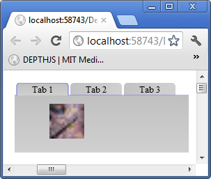 Image Map Control :
To add a image map control to your canvas you would make the following JavaScript call from your web page after the canvas element on which you mean to draw the image map control as follows:
Collapse | Copy Code
createImageMapControl(elemId, 'im1', 250, 200, 200, 150, highestDepth, 'indiamap.gif',
  [[134, 261, 10, '#00FF00'], [219, 291, 7, '#FF0000'], [248, 361, 10, '#0000FF']],
  function (c, w, i) { alert("You clicked on " + (i == 0 ?
  "Mumbai" : (i == 1 ? "Hyderabad" : "Chennai"))); }, 1, 90, 240, 1, 0.1);
The basic function call for creating a image map control is:
Collapse | Copy Code
createImageMapControl(canvasid, controlNameId, x, y, width,
  height, depth, imgurl, pinxys, pinClickFunction, hasZoom, imagetopleftxoffset,
  imagetopleftyoffset, scale, scaleincrementfactor, tag)
The first thing of course is to supply a url to load the image from. In this case I use an India map since I am from that country however you can use any image does not have to be a map that you need to put pins or pan and zoom. The pinxys is an array in which each element of the array is [x, y, radius, color]. The x and y is relative to the top left corner of the image being 0, 0. You can use Gimp or any image manipulation software to find the x, y pixel co-ordinates within the image to supply for each point you want a pin. The radius is of course the radius of the pin to be drawn at that x, y co-ordinate on the image. The
pinClickFunction is invoked when the user clicks a pin and you are supplied with the standard canvas id and window id and an index i into the pinxys array. In the case of the example I make it simple by just saying the name of the city whose pin you clicked on. If
hasZoom is 1 then you will be able to zoom in and out with the mouse wheel. This will work with any browser such as Google Chrome which supports onmousewheel event which is what I use. The
imagetopleftxoffset and
imagetopleftyoffset is the point on the image to start showing the portion of the image in the window at startup. Again it follows the rules of pinxys co-ordinates. Scale is whatever scale you want to startup with if the scale is too small or your starting window into the image is off image you will not see an image at all so be careful and pick meaningful values i.e. ones which will crop a portion on the image without going off it. The
scaleincrementfactor is by how much per mouse wheel move do you want to zoom in and out so in the example I choose 0.1 so it scales slowly on mousewheel as my image for the example is not very large.
A screenshot of the example follows below:
 Menu Bar Control :
To add a menu bar control to your canvas you would make the following JavaScript call from your web page after the canvas element on which you mean to draw the menu bar control as follows:
Collapse | Copy Code
createMenuBarControl(elemId, 'mb1', 0, 0, 800, 20, highestDepth, [['File', '#000000', 10,
  '10pt Ariel', 0, null, [['Save', '#000000', 10, '10pt Ariel', 0,
         function () { alert('You choose Save from the menu.'); },
  null], ['Save As', '#000000', 10, '10pt Ariel', 0,
         function () { alert('You choose Sava As from the menu'); },
  null], ['Options', '#000000', 10, '10pt Ariel', 0, null,
         [['Advanced', '#000000', 10, '10pt Ariel', 0,
  function () { alert('You choose Advanced from the menu'); },
                null], ['Configuration', '#000000', 10, '10pt Ariel', 0,
  function () { alert('You choose Configuration from the menu'); },
                null]]]]], ['Help', '#000000', 10, '10pt Ariel', 0,
  function () { alert('You choose Help from the menu'); }, null]],
                '#bec7ff', '#848ec9', '#515eac', '#e3e7ff', '#c5cdff', 0);
The basic function call for creating a menu bar control is:
Collapse | Copy Code
createMenuBarControl(canvasid, controlNameId, x, y, width, height,
  depth, data, barcolorstart, barcolormiddle, barcolorend,
  dropdowncolorstart, dropdowncolorend, orientation, tag)
The data format is complex because each item in the menu's text can be configured to any font and size specification. Basically each menu item is defined as an array whose first element is the text label to display in the menu. The second element is the color of the text. The third element is the height of the text. The fourth element is the font specification. The fifth element always set it to 0 as it is used internally by the code to determine if the menu items sub menu if any is to be displayed. The fifth element is the function to invoke when the user clicks the menu item. The sixth and final element is an array of the same menu item element arrays as defined here. If the item has no sub menu with child menu items then set this sixth parameter to null. The orientation parameter is not implemented as yet but that allows for menu bars on the bottom and sides when implemented.
A screenshot of the example menu bar with a sub menu item clicked on is shown below:
 TextBox Control :
To add a textbox control to your canvas you would make the following JavaScript call from your web page after the canvas element on which you mean to draw the textbox control as follows:
Collapse | Copy Code
createTextBox(elemId, 'textbox1', 400, 10, 300, 60, highestDepth, 'Type your name here',
  '#F0F0F0', 18, '18pt Ariel', '#051329', 18, '18pt Ariel', 50, '[a-Z]+', 0, null, 1, '#2e3642', 1, 0,
  '#000000', 3, 3, 20, 1, 10, 1, '#9bacc6', '#d6e4f9',
  0, null, 0, null, 0, 0, 0, null, '', '#0d2952', '#0000F0', 1);
The basic function call for creating a textbox control is:
Collapse | Copy Code
createTextBox(canvasid, controlNameId, x, y, width, height, depth,
  waterMarkText, waterMarkTextColor, waterMarkTextHeight, waterMarkTextFontString, textColor,
  textHeight, textFontString, maxChars, allowedCharsRegEx, isPassword, passwordChar, hasBorder,
  borderColor, borderLineWidth, hasShadow, shadowColor, shadowOffsetX, shadowOffsetY, shadowBlurValue,
  hasRoundedEdges, edgeRadius, hasBgGradient, bgGradientStartColor, bgGradientEndColor, hasBgImage,
  bgImageUrl, hasAutoComplete, listPossibles, dropDownPossiblesListIfThereIsInputText, limitToListPossibles,
  listPossiblesTextHeight, listPossiblesTextFontString, initialText,
  caretColor, textSelectionBgColor, hasFocusInitially)
The Watermark properties define what the textbox will look like when it is empty which will display the watermark message. The Text properties are information on how to draw the text the user types into the textbox. The maxChars limits how many chars you can type in. The
allowedCharsRegEx is a regular expression against which whatever the user types will be checked character by character. If its an invalid character it wont effect the value of the text. The Password properties are if the text should be hidden and what letter to use. The border properties are used to draw a border around the textbox. The Shadow doesnt work right now but is meant to put a dropdown shadow for the control. The Edge properties define if the textbox will have rounded corners. The gradient properties define if you want a gradient for the background of the textbox. You can use the image properties to insert an image into the background of the textbox. The auto completion parameters limit the user optionally to only type values of text from the given array of strings. The
initialText can be supplied with some text to initially display as though the user typed it. The
caretColor is the color used to paint the caret. The
selectionColor is used to paint the background of the selection. If you want this text box to have focus on the form initially set the
hasFocusInitially to 1.
Screen shot of the example text with no user input:

Screen shot of the example with my name typed into the textbox:
 Image Fader Control :
To add a image fader control to your canvas you would make the following JavaScript call from your web page after the canvas element on which you mean to draw the image fader control as follows:
Collapse | Copy Code
createImageFader(elemId, 'MoviePosters', 500, 200, 135, 200, highestDepth, ['fantastic_four.jpg',
  'IncredibleHulk.jpg', 'Thor.jpg', 'xmen_first_class.jpg'], 0, 1, 0.01, 100, function (canvasid, windowid, e, i)
  { var imageFaderProps = getImageFaderProps(canvasid, windowid); alert(imageFaderProps.ImageURLs[i]); }, 1);
The basic function call for creating a image fader control is:
Collapse | Copy Code
createImageFader(canvasid, controlNameId, x, y, width, height, depth,
  imageURLs, fadeStartValue, fadeEndValue, fadeStepValue, holdForTicks, clickFunction, overlayimages)
The imageURLs is an array of URL's to the images to display. The
fadeStart value is an alpha number which is between 0 and 1 and determines the extent to which the image is faded out before the next image is displayed. The fadeEndValue is again between 0 and 1 and this is the maximum or final alpha value the image will be displayed at. The
fadeStepValue is how to increment which basically determines the fade rate of the image i.e. how fast or slow it will fade. The holdForTicks is the number of ticks draw calls the picture will display at maximum alpha which in my example is completely opaque 1. The
clickFunction is your custom code to do when the current image is clicked in the example I alert the URL of the image that was clicked on basically given access to the properties and the index of the image which is current which was clicked you can do anything including a server side postback. The overlayimages is 1 if you want the previous image to fade smoothly out into the current or next image.
Image Slider Control :
To add a image slider control to your canvas you would make the following JavaScript call from your web page after the canvas element on which you mean to draw the image slider control as follows:
Collapse | Copy Code
createImageSlider(elemId, 'MoviePosters2', 500, 500, 135, 200, highestDepth,
  ['fantastic_four.jpg', 'IncredibleHulk.jpg', 'Thor.jpg', 'xmen_first_class.jpg'],
  1, -1, 100, function (canvasid, windowid, e, idx) { alert(idx.toString()); });
The basic function call for creating a image fader control is:
Collapse | Copy Code
createImageSlider(canvasid, controlNameId, x, y,
  width, height, depth, imageURLs, direction, stepIncrement, holdForTicks, clickFunction)
The imageURLs is an array of URL's to the images to display. The direction is either 1 or 0. If it is 1 then it will slide the images sideways if it is 0 it will slide the images vertically. If
stepIncrement is positive and direction is 1 then it will slide rightways if it is negative then will slide leftways. If
stepIncrement is positive and direction is 0 then it will slide it bottom to top and if negative top to bottom. The
holdForTicks is the number of ticks to hold the image before it begins to slide again. In the example
clickFunction an alert message is displayed with the index of the image which is index into imageURLs array.
Boundary Fillable Map Control :
To add a boundary fillable map control to your canvas you would make the following JavaScript call from your web page after the canvas element on which you mean to draw the boundary fillable map control as follows:
Collapse | Copy Code
createBoundaryFillableMap(elemId, 'bfm1', 10, 420, 500, 389, highestDepth, [[95, 155,
  40, 130, 160, 185, 255, 255, 255, 255, 0, 0, 255, 255], [338, 180, 320, 160, 360,
  205, 255, 255, 255, 255, 0, 255, 0, 255]], 'WorldMap.png', 500, 389);
The basic function call for creating a image fader control is:
Collapse | Copy Code
createBoundaryFillableMap(canvasid, controlNameId, x, y, width,
           height, depth, fillpoints, imgurl, imgwidth, imgheight)
The fillpoints is an array of arrays. Each array has the format of the first 2 elements being the x, y co-ordinates on the map to start filling at. The next 2 elements are the x, y co-ordinates top left corner of the bounding box within which to do the filling and of course the next 2 elements are the x, y co-ordinates of the bottom right hand corner of the bounding box. The next 4 elements is the RGBA in 0 to 255 values of the original color and of course the next 4 elements are the RGBA color to replace it with. The image WorldMap.png is an outline drawing with countries borders lined out and my image was otherwise white background. Of course the filling algorithm is available in a seperate function should you want to combine this with any control if you so choose to. Since there is already a map control which is scalable, zoomable and with pins and labels I did not make this map control do all that as it can be easily combined if you read the code.

If you want to do partial fills then the fillpoints array element has an additional 3 elements the first is orientation which if 0 fills horizontally along x in which case of course the next to elements are the x minimum and x maximum to fill upto. Be careful with the number since I am giving you full control you must know your points within the image or it will lead to unknown results. Similarly if orientation is 1 then next element is y minimum and thereafter y maximum. Basically the starting point you provide for you partial fill should be between the bounds horizontal x minimum and x maximum or vertical y minimum and y maximum or it will produce unknown results.
The following example is how to fill horizontally from left to right for america only in blue color:
Collapse | Copy Code
createBoundaryFillableMap(elemId, 'bfm1', 800, 400, 500, 389, highestDepth,
  [[95, 155, 40, 130, 160, 185, 255, 255, 255, 255, 0, 0, 255, 255, 0, 40, 100],
  [338, 180, 320, 160, 360, 205, 255, 255, 255, 255, 0, 255, 0, 255]],
  'WorldMap.png', 500, 389);
The following is the example generated image:

The following example is how to fill horizontally from right to left for america only in blue color:
Collapse | Copy Code
createBoundaryFillableMap(elemId, 'bfm1', 800, 800, 500, 389, highestDepth,
  [[95, 155, 40, 130, 160, 185, 255, 255, 255, 255, 0, 0, 255, 255, 0, 100, 160],
  [338, 180, 320, 160, 360, 205, 255, 255, 255, 255, 0, 255, 0, 255]], 'WorldMap.png', 500, 389);
The following is the example generated image:
 Multi Line Label Control :
To add a multi line label control to your canvas you would make the following JavaScript call from your web page after the canvas element on which you mean to draw the multi line label control as follows:
Collapse | Copy Code
createMultiLineLabel(elemId, 'mll1', 250, 400, 200, highestDepth, 0,
  'This is a very long sentance to test word wrap.  My name is \nAkshay Srinivasan\n and ' +
  'this is a multi line label control demo.  It is a control that is one of the many controls ' +
  'in Canvas Control Library which is a system of building web pages that has been made ' +
  'possible by the new HTML5 element called canvas.', '#000000', 12, '12pt Ariel', 5, 1);
Collapse | Copy Code
createMultiLineLabel(elemId, 'mll1', 250, 800, 200, highestDepth, 1,
  '<NT>This is a </NT><N><C>#FF0000</C><F>16pt ' +
  'Ariel</F><T>very long</T></N><NT> sentance to test word wrap. ' +
  ' My name is </NT><N><C>#00FF00</C><F>bold italic 14pt Tahoma<' +
  '/F><T>\nAkshay Srinivasan\n</T></N><NT> and this is a multi line label ' +
  'control demo.  It is a control that is one of the many controls in Canvas Control Library which' +
  ' is a system of building web pages that has been made possible by the new </NT><N>' +
  '<C>#0000FF</C><F>10pt Ariel</F><T>HTML5</T></N><NT>' +
  ' element called canvas.</NT>', '#000000', 16, '12pt Ariel', 5, 1);
The basic function call for creating a multi line label control is:
Collapse | Copy Code
createMultiLineLabel(canvasid, controlNameId, x, y, width,
  depth, hasMarkup, text, textColor, textHeight, textFontString, lineSpacingInPixels, wordSensitive)
This control auto determines the height so this is one of the few controls where you don't specify the height. The hasMarkup if set to 0 will then render the text parameter as is. If it is set to 1 then it will assume you have markup in the text parameter which is a bunch of tags which you can see in the second example:
- <NT> - This is normal text which means it will use the text color, height and font from the parameters supplied to the function call.
- <N> This means this is specially formatted text which has a bunch of tags with which to specify the text formatting:
- <C> - This is the color of the text
- <F> - This is the font string
- <T> - This is the actual text string
- Also to specify a line break you can use \n in the text string.
The
lineSpacingInPixels is the gap between the lines to add. The
wordSensitive parameter if set to 1 will take a word which is too long to fit at the end of the line and look for the space before it and break it at that point onto a new line. If this is set to 0 then words will break in the middle on a new line with no dash.This control allows you to now be able to make regular paragraph like text without resorting to regular HTML5 text so that you can stay within the system.
Screenshot of simplex text (not marked up) follows:

Screenshot of marked up text that is text with different font metrics and colors:
 Word Processor Control :
To add a word processor control to your canvas you would make the following JavaScript call from your web page after the canvas element on which you mean to draw the word processor control as follows:
Collapse | Copy Code
createWordProcessor(elemId, 'Wp1', 800, 400, 400, 224, highestDepth, 0, '',
  '#051329', 12, '12pt Ariel', 5, 1, 'Type a paragraph here.', '#F0F0F0', 14, '14pt Ariel',
  2000, 0, '#000000', 1, 1, 1, 10, 1, '#9bacc6',
  '#d6e4f9', 0, null, 10, 1, '#2e3642', 1, '.+', '#0d2952');
The basic function call for creating a word processor control is:
Collapse | Copy Code
createWordProcessor(canvasid, controlNameId, x, y, width, height,
  depth, hasMarkup, text, textColor, textHeight, textFontString,
  lineSpacingInPixels, wordSensitive,
  waterMarkText, waterMarkTextColor, waterMarkTextHeight,
  waterMarkTextFontString, maxChars, hasShadow,
  shadowColor, shadowOffsetX, shadowOffsetY, hasRoundedEdges, edgeRadius, hasBgGradient,
  bgGradientStartColor, bgGradientEndColor, hasBgImage, bgImageUrl, margin, hasBorder,
  borderColor, borderLineWidth, allowedCharsRegEx, caretColor)
The word processor control is essentially a multi line text box. As of now marked up text is not available so
hasMarkup has to be 0 until the markup code is functioning. So it is plain text as defined by the textColor, textFontString metrics supplied. Works much like textbox control but is multi line instead of just single line. In the example I allow any characters by setting
allowedCharsRegEx to .+. One of the limitations is that the height of the word processor/multi line textbox has to be for optimal presentation results a multiple of double the margin plus number of lines multiplied by the sum of text height plus the line spacing in pixels.
Screenshot of the word processor control blank (no user input) with watermark text displayed:

Screenshot of the word processor with a paragraph of user inputted text:
 Virtual Keyboard Control :
To add a virtual keyboard control to your canvas you would make the following JavaScript call from your web page after the canvas element on which you mean to draw the virtual keyboard control as follows:
Collapse | Copy Code
createVirtualKeyboard(elemId, 'vkb1', 500, 600, 360, 180, highestDepth, null,
  function (c, w, l) { alert(l); }, 5, 5, 1, 12, '12pt Ariel');
The basic function call for creating a virtual keyboard control is:
Collapse | Copy Code
createVirtualKeyboard(canvasid, controlNameId, x, y,
  width, height, depth, keys, keypressFunc, gapbetweenbuttons, gapbetweenrows, hasgloss,
  textheight, textfontstring, customDrawLetterFunc)
The virtual keyboard control has an array keys which defines the keys the keyboard will layout for you. A key is defined as an array in which the letter is first element, then width of the key, height of the key and optionally an index to another keyboard. A keyboard array is an array of rows which holds arrays of keys as defined previously. The keys array is finally an array of keyboard arrays. So this way you can index into your keyboard array to have special keys that switch keyboards. I recommend as in the example you pass in null for keys which will get you the default keyboard. The example defines a simple keypress function which alerts the letter of the key pressed on the virtual keyboard.
A screenshot of the virtual keyboard is shown below:

Screenshot of virtual keyboard after '12#' button is pressed which indexes off to another layout for the virtual keyboard is shown below:
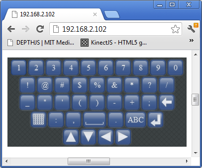
Additionally checking goes on for textbox and word processor control if the browser is on a Android or iPhone/iPad/iPod and will display accordingly. However caution is to be taken when using this as response on old devices such as iPad2 and even an HTC Sensation XL Android phone is bad. Maybe on more powerful devices such as Samsung Galaxy S3 and iPhone 5 it might be usable. But I do not have access or the means to purchase these platforms so some feedback from the lucky ones to own the more powerful smartphones and tablets would be nice. The problem I think is that the Javascript engine in these mobile devices browsers is not fast enough or just that processor cannot handle crunching another layer of abstraction Javascript in the mobile browser.
The new window drawing system has much improved response on my iPad2 and HTC Sensation XL Android phone is now acceptable usability wise though it is not as fast and responsive as the native browser HTML5 elements or the native keyboard.
Splitter Control :
To add a splitter control to your canvas you would make the following JavaScript call from your web page after the canvas element on which you mean to draw the splitter control as follows:
Collapse | Copy Code
var panelwindowid = createPanel(elemId, 'p1', 0, 0,
  200, 200, highestDepth, 1, '#c8c8c8', 1, '#d1ddff', '#a7afc6');
registerChildWindow(elemId, createProgressBar(elemId, 'pg1', 10, 100,
  200, 20, highestDepth, '#33ec25', 100, 0, 60), panelwindowid);
registerChildWindow(elemId, createSlider(elemId, 's1', 10, 150, 200,
  20, highestDepth, 10, 100, 0, 50), panelwindowid);
var panelwindowid2 = createPanel(elemId, 'p2', 204, 0, 200, 200,
  highestDepth, 1, '#c8c8c8', 1, '#d1ddff', '#a7afc6',
  1, 150, 0, 'Test Panel', '#000000', 12, '12pt Ariel',
  '#cfcfcf', '#ababab', 20, '#495be5', 1, 7);
registerChildWindow(elemId, createProgressBar(elemId, 'pg2', 210, 10,
  200, 20, highestDepth, '#33ec25', 100, 0, 60), panelwindowid2);
registerChildWindow(elemId, createSlider(elemId, 's2', 210, 100, 200,
  20, highestDepth, 10, 100, 0, 50), panelwindowid2);
createSplitter(elemId, 'spl1', 201, 0, 3, 200, highestDepth, '#D0D0D0');
The basic function call for creating a splitter is:
Collapse | Copy Code
function createSplitter(canvasid, controlNameId, x, y, width, height, depth, linecolor)
The splitter is a line that sits between some windows horizontally or vertically. If width is greater than height it means its a horizontally aligned splitter. What the splitter will do is it will figure out what windows are within 2 pixels of its line and adjust their width or origin as the splitter is dragged.
Simple XML Viewer Control :
To add a simple XML viewer control to your canvas you would make the following JavaScript call from your web page after the canvas element on which you mean to draw the simple XML viewer control as follows:
Collapse | Copy Code
createSimpleXMLViewer(elemId, 'sxmlvr1', 10, 500, 200, 250, highestDepth,
  '<root><Databases><Employees><Tables><Employee><Column
   ColumnName="id">1</Column><Column
   ColumnName="FirstName">Akshay</Column><Column
   ColumnName="MiddleName"></Column><Column
   ColumnName="LastName">Srinivasan</Column><Column
   ColumnName="EmpId">42312345672892</Column></Employee>
   </Tables></Employees></Databases></root>',
  '#000000', '12pt Ariel', 12, null, null, 1, 16, 16, 'Node.png',
  'Value.png', 'Attribute.png');
The basic function call for creating a simple XML viewer is:
Collapse | Copy Code
function createSimpleXMLViewer(canvasid, controlNameId, x, y, width, height,
   depth, xml, textcolor, textfontstring, textheight, clickNodeFunction,
   tag, hasicons, iconwidth, iconheight, imgURLNode, imgURLValue, imgURLAttribute)
The simple XML viewer control at its bases uses the treeview control to accept some XML supplied by the user and draw it out as a tree. There is an example in the download of this which works. The XML must start with <root> tag and end with </root> tag basically well formed XML that is understood by the DOMParser in javascript is all it supports.
A screenshot of the code example follows:
 Voting Control :
To add a voting control to your canvas you would make the following JavaScript call from your web page after the canvas element on which you mean to draw the voting control as follows
Voting Control :
To add a voting control to your canvas you would make the following JavaScript call from your web page after the canvas element on which you mean to draw the voting control as follows:
Collapse | Copy Code
createVotingControl(elemId, 'vc1', 450, 150, 300, 30, highestDepth,
  5, 10, 59, 172, 53, 255, 0, 5, 1, 0, 1, 180, 21, '#000000', '12pt Ariel',
  12, 0, 0, 6.7, 1, 0, 0, 1, 'duckoutline.png', [15, 13, 0, 0, 30, 26, 255,
  255, 255, 255, 59, 172, 53, 255], 30, 26, 0, 255, 255, 255, 255);
Collapse | Copy Code
createVotingControl(elemId, 'vc2', 450, 200, 300, 30,
  highestDepth, 5, 5, 213, 210, 0, 255, 30, 5, 1, 1, 1, 180, 21, '#000000',
  '12pt Ariel', 12, 0, 0, 3.5, 1, 0, 0, 0, null, null, 30, 30, 0, 0, 0, 0, 0,
  function (canvasid, windowid, votingProps, clickx, clicky, value) {
  votingProps.InitialValue = value; invalidateRect(canvasid, null,
  votingProps.X, votingProps.Y, votingProps.Width, votingProps.Height); });
Collapse | Copy Code
createVotingControl(elemId, 'vc3', 450, 250, 300, 30, highestDepth, 5, 5, 59, 172, 53, 255, 0, 5, 1, 1, 1, 180, 21, '#000000', '12pt Ariel', 12, 0, 0, 0.5, 1, 0, 0, 1, 'staroutline.png', [8, 8, 0, 0, 30, 26, 255, 255, 255, 255, 59, 172, 53, 255], 17, 17, 0, 255, 255, 255, 255, function (canvasid, windowid, votingProps, clickx, clicky, value) { votingProps.InitialValue = value; invalidateRect(canvasid, null, votingProps.X, votingProps.Y, votingProps.Width, votingProps.Height); }, 1);
The basic function call for creating a voting control is:
Collapse | Copy Code
function createVotingControl(canvasid, controlNameId, x, y, width,
  height, depth, numstars, maxvalueofallstars, starcolorred, starcolorgreen,
  starcolorblue, starcoloralpha, starsizeinpixels, spacinginpixelsbetweenstars,
  haspartialstars, editable, hasvaluelabel, labelxpos, labelypos, labeltextcolor,
  labeltextfontstring, labeltextheight, starsstartingposoffsetwhenlabel,
  starsyposwhenlabel, initialvalue, outlinethicknessofemptystar, starsorientation,
  fillorientation, iscustompattern, outlineimgurl, customfillpoint, imgwidth,
  imgheight, hasmouseoverlabel, staroutlinebgcolorred, staroutlinebgcolorgreen,
  staroutlinebgcolorblue, staroutlinebgcoloralpha, customclickfunction,
  rounddisplayedvaluetonumofdecimals)
The parameter numstars is the number of shapes you want shown. Maxvalueofallstars if the total values of all stars being filled value. Then the color to fill the shape/stars with is provided in rgba. If you are using standard star then the size of the star its width and height are same by default. Then the spacing between shapes/stars drawn is provided. If you are partial filling a star for a fractional value then this will be 1 if not 0. One of the things to note about partial complex shape filling is that when filling horizontally the middle of the image should be completely within the outline shape provided for standard star this is the case. For the duck outline I have used what would be more appropriate is that the graphics artist raised one leg of the duck along the middle horizontal. Editable basically means clickable and value changeable on clicking. The next parameters defines the label which will be 'value out of max value of all stars'. If you want to offset the starting position of drawing the stars then provide something other than 0 for this parameter. Initialvalue is just the value to start with for filling the stars/complex shape. If you want a thicker outline line for empty stars then provide something greater than 1. Starorientation is how to draw out the stars 0 means horizontally 1 means vertically. Fillorientation is how to fill a star horizontally 0 vertically 1. Iscustompattern means you are going to provide an image with an outline shape like my duck example. Customfillpoint is defined in BoundaryFillableMap so refer there on how to construct the array. Basically you provide the point within an empty shape to fill your complex shape. Then the width and height of the image. Then the rgb value of the background color. If you want to do something custom on clicking pass in your custom click function here. Then how many decimals to round the displayed value if there is a label.
Screenshot for the examples above in that order top to bottom:

Window Draw system changed for performance on mobile devices
The new system of drawing out the windows is not to draw all the windows on the canvas over but to use the function invalidateRect to invalidate an area. All windows then falling in that area are the only ones redrawn. This change is reflected in the new animation system as well as only the animated window will be redrawn to this effect you have to supply a windowid now to the registerAnimatedWindow function call. This makes though your code more complex as can be seen in the FormsBases.aspx example which is now has more complex code logic to redraw effected windows which the system would not know got changed.
Example of a customized ComboBox Control with Pictures in the dropdown :
The following HTML creates an example of a ComboBox control with pictures in the dropdown area:
Collapse | Copy Code
<canvas id="canvas1" width="500"
   height="500" tabindex="0"></canvas>
<script type="text/javascript">
registerCanvasElementId('canvas1');
createComboBox('canvas1', 'cb1', 10, 10, 150, 20, highestDepth,
    ['Bombay', 'Pune', 'Madras', 'Delhi'], null, null, drawListAreaCustom, null,
    listAreaCustomClickFunction, '#364635', 10, '10pt Ariel', '#1b213b', 10, '10pt Ariel');
invalidateRect(elemId, null, 0, 0, 500, 500);
function drawListAreaCustom(canvasid, windowid) {
    var comboboxProps = getComboboxPropsByListAreaWindowId(canvasid, windowid);
    var vscrollBarProps = getScrollBarProps(canvasid, comboboxProps.VScrollBarWindowID);
    var ctx = getCtx(canvasid);
    ctx.fillStyle = '#FFFFFF';
    ctx.beginPath();
    ctx.rect(comboboxProps.X, comboboxProps.Y + comboboxProps.Height, comboboxProps.Width - 15, 100);
    ctx.fill();
    ctx.fillStyle = comboboxProps.ListAreaTextColor;
    ctx.font = comboboxProps.ListAreaFontString;
    for (var i = vscrollBarProps.SelectedID; i <
           comboboxProps.Data.length && ((comboboxProps.ListAreaTextHeight + 10) *
        (i - vscrollBarProps.SelectedID + 1)) + 4 < 100; i++) {
        switch (comboboxProps.Data[i]) {
            case 'Bombay':
                drawCustomImage(ctx, comboboxProps.X, comboboxProps.Y + 4 +
                    ((comboboxProps.ListAreaTextHeight + 10) *
                      (i - vscrollBarProps.SelectedID + 1)), 16, 16, 'Bombay.png');
                break;
            case 'Pune':
                drawCustomImage(ctx, comboboxProps.X, comboboxProps.Y + 4 +
                    ((comboboxProps.ListAreaTextHeight + 10) *
                      (i - vscrollBarProps.SelectedID + 1)), 16, 16, 'Pune.png');
                break;
            case 'Madras':
                drawCustomImage(ctx, comboboxProps.X, comboboxProps.Y + 4 +
                    ((comboboxProps.ListAreaTextHeight + 10) *
                      (i - vscrollBarProps.SelectedID + 1)), 16, 16, 'Madras.png');
                break;
            case 'Delhi':
                drawCustomImage(ctx, comboboxProps.X, comboboxProps.Y + 4 +
                    ((comboboxProps.ListAreaTextHeight + 10) *
                      (i - vscrollBarProps.SelectedID + 1)), 16, 16, 'Delhi.png');
                break;
        }
        ctx.fillText(comboboxProps.Data[i], comboboxProps.X + 20, comboboxProps.Y + 17 +
                    ((comboboxProps.ListAreaTextHeight + 10) * (i - vscrollBarProps.SelectedID + 1)));
    }
    ctx.strokeStyle = '#b7bfc8';
    ctx.beginPath();
    ctx.rect(comboboxProps.X, comboboxProps.Y +
        comboboxProps.Height, comboboxProps.Width - 15, 100);
    ctx.stroke();
}
var preloadedImages = new Array();
function drawCustomImage(ctx, x, y, width, height, src) {
    for (var i = 0; i < preloadedImages.length; i++) {
        if (preloadedImages[i].Src == src) {
            ctx.drawImage(preloadedImages[i].Image, x, y);
            return;
        }
    }
    var image = new Image(width, height);
    image.src = src;
    image.onload = function () {
        preloadedImages.push({ Src: src, Image: image });
        ctx.drawImage(image, x, y);
    };
}
function listAreaCustomClickFunction(canvasid, windowid, e) {
    var comboboxProps = getComboboxPropsByListAreaWindowId(canvasid, windowid);
    var vscrollBarProps = getScrollBarProps(canvasid, comboboxProps.VScrollBarWindowID);
    var canvas = getCanvas(canvasid);
    var x = e.calcX;
    var y = e.calcY;
    for (var i = vscrollBarProps.SelectedID; i < comboboxProps.Data.length &&
          ((comboboxProps.ListAreaTextHeight + 10) * (i - vscrollBarProps.SelectedID + 1)) < 100; i++) {
        if (x > comboboxProps.X && y > comboboxProps.Y + 4 + comboboxProps.Height +
          ((comboboxProps.ListAreaTextHeight + 10) * (i - vscrollBarProps.SelectedID)) &&
            x < comboboxProps.X + comboboxProps.Width - 15 && y < comboboxProps.Y +
              comboboxProps.Height + 4 + ((comboboxProps.ListAreaTextHeight + 10) *
            (i - vscrollBarProps.SelectedID + 1))) {
            comboboxProps.SelectedID = i;
            setHiddenWindowStatus(canvasid, comboboxProps.VScrollBarWindowID, 1);
            setHiddenWindowStatus(canvasid, comboboxProps.ListAreaWindowID, 1);
            draw(canvasid);
            return;
        }
    }
}
</script>
The above JavaScript uses 4 images by the name of
Bombay.png,
Pune.png,
Madras.png,
Delhi.png. You can use any images with different file names long as you change the image URLs in the
switch case statement in function
drawListAreaCustom.
A screenshot of the above example follows:
 How to use the new Forms Based System :
The current concept on how forms work with web pages is that when you click for example a button that requires a post back to do something on the server side what will happen with regular web page technology is that all the controls values will be sent to the server plus in the case of ASP.NET viewstate the state of the controls as well. The control values will be unwrapped by the PHP or ASP.NET module and a php or aspx server side page and function will be invoked in which your code will make some changes. Then a whole new web page is sent back to the client web browser.
In this new system I have invented what happens is that when you do something with a control for example a button that requires some code to be executed on the server side all the controls state and values are wrapped up and sent across to the server side in an AJAX call which goes to an ASP.NET web page which has included the CanvasControlLibrary.cs file that has all the support. Your C# function whose name you provide is invoked you make all the changes to the control values and states in the example change the text of a label. Then all the controls state and values are wrapped up in XML and sent back to the same page the client browser is on since its an AJAX call and then unwrapped replacing all the old values of the control states and values with the new ones you changed server side. The UI is redrawn and the changes you made to the controls reflected on the same web page. The client never leaves the web page on a post back to the server side to go to another web page which is the normal practice.
So here is the client side code which is a button that invokes a server side C# function on an aspx page:
Collapse | Copy Code
createLabel(elemId, 'l1', 150, 10, 100, 20, 'Label 1', '#000000', 12, '12pt Ariel', null, highestDepth);
Collapse | Copy Code
createButton(elemId, 'b3', 30, 74, 250, 40,
  'Custom Click Function', '#0000FF', 12, '12pt Ariel',
  2, highestDepth + 1, function (canvasid, windowid)
  { invokeServerSideFunction('AjaxEx1.aspx', 'ClickMe',
  elemId, windowid, function () { alert('Did Postback'); }); },
  null, '#bee6fd', '#a7d9f5', '#eaf6fd', '#d9f0fc', '#3c7fb1');
The code on the server side is pretty simple and follows below:
Collapse | Copy Code
public partial class Default2 : System.Web.UI.Page
{
    CanvasControlLibrary ccl;

    protected void Page_Load(object sender, EventArgs e)
    {
        ccl = new CanvasControlLibrary(Request.InputStream);
        ccl.InvokeServerSideFunction(this.Page);
        ccl.SendVars(Response.OutputStream);
    }

    protected override void Render(HtmlTextWriter writer)
    {
    }

    public void ClickMe(string canvasid, int windowid)
    {
        CanvasControlLibrary.CCLLabelProps lp =
          ccl.getControlPropsByControlNameID("l1") as CanvasControlLibrary.CCLLabelProps;
        lp.Text = "Did Postback";
    }
}
The label declaration in JavaScript function call is normal. The button on the other hand when it is clicked calls a JavaScript function called
invokeServerSideFunction in which all the magic of a post back happens. The function first parameter is the name of web page on which your server side code is at. The next is the name of the function on the aspx page to invoke server side. The third and fourth parameters are just the canvas id and the window id to identify on the server side which control raised the event on the client side. The fifth is a JavaScript function which you code that will be invoked after the post back is completed so you can make further changes on the client side if you wish.
On the server side aspx page in your page load event you have call the server side class and then after it is instantiated invoke the server side function which is the ClickMe C# function on the page. In this example a simple call to get the label control and change its text value to Did Postback. Then you invoke the canvas control library server side class to send all your changes back to the client.
When you download and run the example on clicking the button the label is changed server side from showing text Label 1 to Did Postback. I have kept the example very simple but with this system you can create fully functional pages. In the case of wanting forms all you do is have a startup panel with your controls on it. When you click the button and submit all the information gathered you keep a second panel with all the controls on it which is the form you show and hide the first form. With this ability you can build fully functional web pages with server side post back custom code and build any current form based web pages in the new Canvas Control Library.
A diagram of the basic concept of the system follows below:
 PHP Example:
This example has been tested on Apache and IIS. This is the same as the simple ClickMe example but in PHP instead of C# ASPX page handling the server side postback:
Collapse | Copy Code
<?php
include 'CanvasControlLibrary.class.php';

$parameters = array();
$ccl = new CanvasControlLibrary();
$ccl->InvokeServerSideFunction();
$ccl->SendVars($parameters);

function ClickMe($obj, $canvasid, $windowid)
{
    $lp = $obj->getControlPropsByControlNameID("l1");
    $lp->Text = "Did Postback";
}

?>
It uses pretty much the same page
Default.php as
Default.aspx as there is no PHP or C# code in either. When you click the button the postback happens to code listed above. Here all the stuff is done in PHP class file so you have to include it. You instantiate the library as a class object and do pretty much the same as in the server side ASPX page. Again only a label is changed for the demo.
An example of a working form with postback:
This example is a web page which uses the Canvas Control Library and its forms based system to create a simple web page for a fictional Cinemas called Fake Cinemas. There is a title image logo of the cinema theater company on the top of the page. There is a menu bar which has links to various other pages which at this point is not implemented to do anything. It has movie theaters in four cities in India which are Mumbai, Delhi, Bangalore, and Chennai. The purpose of the starting page is for the customer to select the city which then populates the names of the theaters in that city in then the customer selects the theaters. When the customer selects the multiplex images showing the posters of all the movies playing at the theater and show times is displayed. If you click on a show time label it gets highlighted and a textbox control and button for payment is added. The textbox control is for the number of tickets and only accepts numbers to be typed in it. When you fill it out and click the payment button it does a server side postback and a message is displayed telling you which theater, how many tickets, what movie name and showtime you have booked tickets for. Without further ado here is the client side code:
Collapse | Copy Code
<script type="text/javascript">
var elemId = 'canvas';
var selecteCinemaWindowID;
registerCanvasElementId(elemId);
function cityChanged(canvasid, windowid, index) {
    invokeServerSideFunction('AjaxEx1.aspx', 'onSelectCityChanged', canvasid, windowid, function () {
        var wprops = getWindowProps(elemId, selecteCinemaWindowID);
        invalidateRect(elemId, null, wprops.X, wprops.Y, wprops.Width, wprops.Height);
    });
}
function onSelectCinema(canvasid, windowid, index) {
    invokeServerSideFunction('AjaxEx1.aspx',
         'onSelectCinemaChanged', canvasid, windowid, showMoviesForCinema);
}
function selectMovieTime(canvasid, windowid) {
    var labelProps = getLabelProps(canvasid, windowid);
    var labelWindowProps = getWindowProps(canvasid, windowid);
    labelProps.BackGroundColor = '#899b0d';
    var labelWindowIDS = new Array();
    labelWindowIDS.push(createLabel(elemId, 'numTicketsLabel', 630, 220, 160, 30,
        'Number of Tickets:', '#131aa3', 16, '16pt Ariel', null, highestDepth));
    labelWindowIDS.push(createTextBox(elemId, 'numTicketsTextBox', 800, 220, 50, 30, highestDepth, 'No.',
        '#F0F0F0', 12, '12pt Ariel', '#051329', 12, '12pt Ariel', 2, '[0-9]', 0, null, 1, '#2e3642',
        1, 0, '#000000', 3, 3, 20, 1, 10, 1, '#9bacc6', '#d6e4f9', 0, null, 0, null,
        0, 0, '#D0D000', 12, '12pt Ariel', '', '#0d2952', 'rgba(0, 0, 240, 0.2)', 1));
    labelWindowIDS.push(createButton(elemId, 'PaymentButton', 875, 220, 100, 30,
        'Book Tickets', '#0000FF', 12, '12pt Ariel', 2, highestDepth + 1, 1, 1,
        function (canvasid, windowid) {
            invokeServerSideFunction('AjaxEx1.aspx', 'DoPaymentForTickets', elemId, windowid, afterPayment);
        }, null, '#bee6fd', '#a7d9f5', '#eaf6fd', '#d9f0fc', '#3c7fb1', labelWindowProps.ControlNameID));
    for (var i = 0; i < controlNameIDs.length; i++) {
        var window = getWindowByControlNameID(controlNameIDs[i]);
        if (window.ControlType == 'Label' && window.WindowCount != windowid) {
            var labelProps2 = getLabelProps(canvasid, window.WindowCount);
            labelProps2.BackGroundColor = null;
            labelWindowIDS.push(window.WindowCount);
        }
    }
    for (var i = 0; i < labelWindowIDS.length; i++) {
        var wprops = getWindowProps(elemId, labelWindowIDS[i]);
        invalidateRect(elemId, null, wprops.X, wprops.Y, wprops.Width, wprops.Height);
    }
}
function afterPayment(params) {
    suspendDraw = 1;
    for (var i = 0; i < controlNameIDs.length; i++) {
        destroyControlByNameID(controlNameIDs[i]);
    }
    controlNameIDs = new Array();
    destroyControlByNameID('numTicketsLabel');
    destroyControlByNameID('numTicketsTextBox');
    destroyControlByNameID('PaymentButton');
    destroyControlByNameID('label1');
    destroyControlByNameID('label2');
    destroyControlByNameID('selectCityComboBoxComboBoxTextArea');
    destroyControlByNameID('selectCinemaComboBoxComboBoxTextArea');
    suspendDraw = 0;
    createLabel(elemId, 'PaymentMessageLabel', 10, 220, 1024, 30, params[0],
                  '#131aa3', 16, '16pt Ariel', null, highestDepth);
    invalidateRect(elemId, null, 0, 0, 1024, 768);
}
var controlNameIDs = new Array();
function showMoviesForCinema(params) {
    suspendDraw = 1;
    for (var i = 0; i < controlNameIDs.length; i++) {
        destroyControlByNameID(controlNameIDs[i]);
    }
    controlNameIDs = new Array();
    suspendDraw = 0;
    var xoffset = 0;
    var labelWindowIDS = new Array();
    for (var i = 0; i < params.length; i++) {
        var windowid = createImage(elemId, 'Poster' + i.toString(), 10 +
                          xoffset, 300, 266, 200, highestDepth, params[i][0]);
        controlNameIDs.push('Poster' + i.toString());
        var timesoffset = 0;
        for (var j = 1; j < params[i].length; j++) {
            labelWindowIDS.push(createLabel(elemId, 'MovieTimeLabel' + j.toString() + 'Poster' +
                i.toString(), 10 + xoffset + timesoffset, 510, 50, 20, params[i][j], '#cdc833',
                12, '12pt Ariel', null, highestDepth, null, selectMovieTime, null, 1));
            controlNameIDs.push('MovieTimeLabel' + j.toString() + 'Poster' + i.toString());
            timesoffset += 70;
        }
        xoffset += 296;
    }
    for (var i = 0; i < labelWindowIDS.length; i++) {
        var wprops = getWindowProps(elemId, labelWindowIDS[i]);
        invalidateRect(elemId, null, wprops.X, wprops.Y, wprops.Width, wprops.Height);
    }
}
function form1() {
    createImage(elemId, 'imgTitle', 312, 10, 400, 100, highestDepth + 1, 'Title.png');
    createMenuBarControl(elemId, 'menuBar1', 0, 120, 1024, 60, highestDepth, [['HOME', '#000000', 20,
         '20pt Ariel', 0, null, null], ['TICKETS', '#000000', 20, '20pt Ariel', 0, null, null],
        ['MOVIES', '#000000', 20, '20pt Ariel', 0, null, null], ['CINEMAS', '#000000', 20, '20pt Ariel',
         0, null, null], ['TRAILERS', '#000000', 20, '20pt Ariel', 0, null, null],
        ['CONTACT US', '#000000', 20, '20pt Ariel', 0, null, null]],
         '#fdf2c0', '#f0cc75', '#d99839', '#e3e7ff', '#c5cdff', 0);
    createLabel(elemId, 'label1', 10, 220, 50, 30, 'City',
      '#131aa3', 16, '16pt Ariel', null, highestDepth);
    createComboBox(elemId, 'selectCityComboBox', 75, 220, 200, 30, highestDepth, ['Cities'], null,
      null, null, null, null, '#131aa3', 16, '16pt Ariel',
      '#131aa3', 16, '16pt Ariel', cityChanged);
    createLabel(elemId, 'label2', 300, 220, 120, 30,
      'Multiplex', '#131aa3', 16, '16pt Ariel', null, highestDepth);
    selecteCinemaWindowID = createComboBox(elemId,
      'selectCinemaComboBox', 400, 220, 200, 30, highestDepth,
      ['Select a city first'], null, null, null, null, null, '#131aa3', 16, '16pt Ariel',
       '#131aa3', 16, '16pt Ariel', onSelectCinema);
    return selecteCinemaWindowID;
}
var windowid = form1();
invokeServerSideFunction('AjaxEx1.aspx', 'InitializeForm1', elemId, windowid, null);
invalidateRect(elemId, null, 0, 0, 1024, 768);
</script>
What is going on in here is the first thing the canvas element is declared. Then the
registerCanvasElementId function call JavaScript is invoked client side to initialize the Canvas Control Library system. The next thing a handy form creation function form1 is declared which creates an Image, MenuBar and 2 ComboBox controls one for the city and one for the theaters in the selected city. The function returns any valid windowid of one of the controls on it. The form1 is invoked and all the controls are instantiated. Then
invokeServerSideFunction JavaScript function is called which called the server side AjaxEx1.aspx page via of course AJAX call and invokes on the ASP.NET page the C# function InitializeForm1. The next thing a JavaScript function
cityChanged is declared which invokes another server side function on page AjaxEx1.aspx called
onSelectCityChanged. When the user selects the multiplex then a server side call is made to
onSelectCinemaChanged this sends back information in an array of the image urls of the posters along with show time information. This array is then passed to client side JavaScript function
showMoviesForCinema. In here the first thing is we destroy any old controls displaying movie posters and show times for the last selection if any. We then proceed to create image control to display the first movie poster and then labels for each show time and iterate through the params array. We finally make a call to draw to show the new controls.
Now follows the code on the server side page AjaxEx1.aspx:
Collapse | Copy Code
using System;
using System.Collections.Generic;
using System.Linq;
using System.Web;
using System.Web.UI;
using System.Web.UI.WebControls;
using System.Text;
using System.IO.Compression;
using System.IO;
using System.Text.RegularExpressions;
using System.Xml;
using System.Reflection;
using System.Collections;
public partial class Default2 : System.Web.UI.Page
{
CanvasControlLibrary ccl;
ArrayList parameters = new ArrayList();
ArrayList movieIndexes = new ArrayList();
protected void Page_Load(object sender, EventArgs e)
{
movieIndexes = new ArrayList { new ArrayList { "Phoenix Mills",
new ArrayList { "Fantastic Four", "Ferris Bueller's Day Off",
"Incredible Hulk" } }, new ArrayList { "Juhu", new ArrayList { "Iron Man",
"Point Break", "Spider Man 2" } }, new ArrayList {"Nariman Point",
new ArrayList{"Spider Man 4", "Spider Man 3", "The Avengers"}},
new ArrayList{"Chitrapur",
new ArrayList{"Thor", "Wolverine", "X-Men First Class"}},
new ArrayList{"Khari Baoli",
new ArrayList{"GI Joe Rise of Cobra", "The Avengers",
"Wolverine"}}, new ArrayList{"Lakshmi Garden",
new ArrayList{"Thor", "Point Break", "Iron Man"}},
new ArrayList{"Gandhi Nagar", new ArrayList{"Spider Man 2",
"Incredible Hulk", "GI Joe Rise of Cobra"}}, new ArrayList{"Lake City",
new ArrayList{"The Avengers", "X-Men First Class", "Iron Man"}},
new ArrayList{"Rajaji Nagar",
new ArrayList{"Fantastic Four", "Wolverine", "Thor"}},
new ArrayList{"Harrington Road",
new ArrayList{"The Avengers", "X-Men First Class", "Iron Man"}},
new ArrayList{"Boat Club",
new ArrayList{"GI Joe Rise of Cobra",
"Spider Man 3", "Incredible Hulk"}},
new ArrayList{"Chetpet",
new ArrayList{"Thor", "Fantastic Four", "The Avengers"}}};
ccl = new CanvasControlLibrary(Request.InputStream);
ccl.InvokeServerSideFunction(this.Page);
ccl.SendVars(Response.OutputStream, parameters);
}
protected override void Render(HtmlTextWriter writer)
{
}
public void ClickMe(string canvasid, int windowid)
{
CanvasControlLibrary.CCLLabelProps lp =
ccl.getControlPropsByControlNameID("l1") as CanvasControlLibrary.CCLLabelProps;
lp.Text = "Did Postback";
}
public void InitializeForm1(string canvasid, int windowid)
{
CanvasControlLibrary.CCLComboBoxProps selectCityComboBox =
ccl.getControlPropsByControlNameID("selectCityComboBoxComboBoxTextArea")
as CanvasControlLibrary.CCLComboBoxProps;
selectCityComboBox.Data = new System.Collections.ArrayList();
selectCityComboBox.Data.Add("Select a city");
selectCityComboBox.Data.Add("Mumbai");
selectCityComboBox.Data.Add("Delhi");
selectCityComboBox.Data.Add("Bangalore");
selectCityComboBox.Data.Add("Chennai");
((CanvasControlLibrary.CCLScrollBarProps)ccl.getControlPropsByWindowID(canvasid,
selectCityComboBox.VScrollBarWindowID)).MaxItems = selectCityComboBox.Data.Count.ToString();
}
public void onSelectCityChanged(string canvasid, int windowid)
{
CanvasControlLibrary.CCLComboBoxProps selectCityComboBox =
ccl.getControlPropsByControlNameID("selectCityComboBoxComboBoxTextArea")
as CanvasControlLibrary.CCLComboBoxProps;
CanvasControlLibrary.CCLComboBoxProps selectCinemaComboBox = ccl.getControlPropsByControlNameID(
"selectCinemaComboBoxComboBoxTextArea") as CanvasControlLibrary.CCLComboBoxProps;
selectCinemaComboBox.Data = new System.Collections.ArrayList();
switch (selectCityComboBox.Data[Convert.ToInt32(selectCityComboBox.SelectedID)].ToString())
{
case "Mumbai":
selectCinemaComboBox.Data.Add("Select a Theater");
selectCinemaComboBox.Data.Add("Juhu");
selectCinemaComboBox.Data.Add("Phoenix Mills");
selectCinemaComboBox.Data.Add("Nariman Point");
break;
case "Delhi":
selectCinemaComboBox.Data.Add("Select a Theater");
selectCinemaComboBox.Data.Add("Chitrapur");
selectCinemaComboBox.Data.Add("Khari Baoli");
selectCinemaComboBox.Data.Add("Lakshmi Garden");
break;
case "Bangalore":
selectCinemaComboBox.Data.Add("Select a Theater");
selectCinemaComboBox.Data.Add("Gandhi Nagar");
selectCinemaComboBox.Data.Add("Lake City");
selectCinemaComboBox.Data.Add("Rajaji Nagar");
break;
case "Chennai":
selectCinemaComboBox.Data.Add("Select a Theater");
selectCinemaComboBox.Data.Add("Harrington Road");
selectCinemaComboBox.Data.Add("Boat Club");
selectCinemaComboBox.Data.Add("Chetpet");
break;
default:
selectCinemaComboBox.Data.Add("Select a city");
break;
}
((CanvasControlLibrary.CCLScrollBarProps)ccl.getControlPropsByWindowID(canvasid,
selectCinemaComboBox.VScrollBarWindowID)).MaxItems =
selectCinemaComboBox.Data.Count.ToString();
}
public void DoPaymentForTickets(string canvasid, int windowid)
{
CanvasControlLibrary.CCLButtonProps buttonProps =
ccl.getControlPropsByWindowID(canvasid, windowid.ToString())
as CanvasControlLibrary.CCLButtonProps;
CanvasControlLibrary.CCLLabelProps lp =
ccl.getControlPropsByControlNameID((string)buttonProps.Tag)
as CanvasControlLibrary.CCLLabelProps;
CanvasControlLibrary.CCLTextBoxProps textbox =
ccl.getControlPropsByControlNameID("numTicketsTextBox")
as CanvasControlLibrary.CCLTextBoxProps;
CanvasControlLibrary.CCLComboBoxProps selectCinemaComboBox =
ccl.getControlPropsByControlNameID("selectCinemaComboBoxComboBoxTextArea")
as CanvasControlLibrary.CCLComboBoxProps;
Regex regex = new System.Text.RegularExpressions.Regex(
"MovieTimeLabel[0-9]+Poster(?<PosterIndex>[0-9]+)");
Match m = regex.Match((string)buttonProps.Tag);
int movieIndex = Convert.ToInt32(m.Groups["PosterIndex"].Value);
string movieName = "";
for (int i = 0; i < movieIndexes.Count; i++)
{
if (((ArrayList)movieIndexes[i])[0].ToString() ==
selectCinemaComboBox.Data[Convert.ToInt32(selectCinemaComboBox.SelectedID)].ToString())
{
movieName = ((ArrayList)((ArrayList)movieIndexes[i])[1])[movieIndex].ToString();
}
}
parameters.Add("The payment was successful. You have " +
textbox.UserInputText + " tickets to see " + movieName + " at " +
selectCinemaComboBox.Data[Convert.ToInt32(selectCinemaComboBox.SelectedID)].ToString() +
" showing at time " + lp.Text + ".");
}
public void onSelectCinemaChanged(string canvasid, int windowid)
{
CanvasControlLibrary.CCLComboBoxProps selectCinemaComboBox =
ccl.getControlPropsByControlNameID("selectCinemaComboBoxComboBoxTextArea")
as CanvasControlLibrary.CCLComboBoxProps;
switch (selectCinemaComboBox.Data[Convert.ToInt32(selectCinemaComboBox.SelectedID)].ToString())
{
case "Phoenix Mills":
parameters = new ArrayList{new ArrayList { "fantastic_four.jpg",
"1:30 pm", "5:45 pm" }, new ArrayList { "ferrisbuellersdayoff.jpg",
"9:00 pm", "11:30 pm" },
new ArrayList { "IncredibleHulk.jpg", "6:00 pm", "8:30 pm" }};
break;
case "Juhu":
parameters = new ArrayList { new ArrayList { "ironman.jpg", "4:30 pm",
"9:45 pm" }, new ArrayList { "pointbreak.jpg", "6:00 pm",
"7:30 pm" },
new ArrayList { "Spider-Man-2.jpg", "5:00 pm", "10:30 pm" } };
break;
case "Nariman Point":
parameters = new ArrayList { new ArrayList { "spider-man4.jpg", "7:30 pm",
"8:45 pm" }, new ArrayList { "spider_man3.jpg", "2:00 pm",
"5:30 pm" }, new ArrayList { "The-Avengers.jpg", "9:00 pm",
"9:30 pm", "10:30 pm", "11:30 pm" } };
break;
case "Chitrapur":
parameters = new ArrayList { new ArrayList { "thor.jpg", "8:30 pm",
"10:45 pm" },
new ArrayList { "wolverine.jpg", "2:00 pm",
"5:30 pm" },
new ArrayList { "xmen_first_class.jpg", "9:00 pm", "11:30 pm" } };
break;
case "Khari Baoli":
parameters = new ArrayList { new ArrayList { "gijoeriseofcobra.jpg",
"2:30 pm", "5:45 pm" },
new ArrayList { "The-Avengers.jpg",
"8:00 pm", "9:15 pm" },
new ArrayList { "wolverine.jpg", "7:30 pm", "10:15 pm" } };
break;
case "Lakshmi Garden":
parameters = new ArrayList {
new ArrayList { "Thor.jpg", "8:30 pm", "10:45 pm" },
new ArrayList { "pointbreak.jpg", "3:00 pm", "4:15 pm" },
new ArrayList { "ironman.jpg", "8:45 pm", "9:15 pm" } };
break;
case "Gandhi Nagar":
parameters = new ArrayList {
new ArrayList { "Spider-Man-2.jpg", "4:30 pm", "6:45 pm" },
new ArrayList { "IncredibleHulk.jpg", "7:00 pm", "9:15 pm" },
new ArrayList { "gijoeriseofcobra.jpg", "3:45 pm", "4:15 pm" } };
break;
case "Lake City":
parameters = new ArrayList {
new ArrayList { "The-Avengers.jpg", "9:30 pm", "9:45 pm" },
new ArrayList { "xmen_first_class.jpg", "6:00 pm", "8:15 pm" },
new ArrayList { "ironman.jpg", "8:45 pm", "10:15 pm" } };
break;
case "Rajaji Nagar":
parameters = new ArrayList {
new ArrayList { "fantastic_four.jpg", "9:30 pm", "11:45 pm" },
new ArrayList { "wolverine.jpg", "8:00 pm", "9:15 pm" },
new ArrayList { "Thor.jpg", "6:45 pm", "10:15 pm" } };
break;
case "Harrington Road":
parameters = new ArrayList {
new ArrayList { "The-Avengers.jpg", "10:30 pm", "10:45 pm" },
new ArrayList { "xmen_first_class.jpg", "9:00 pm", "10:15 pm" },
new ArrayList { "ironman.jpg", "8:45 pm", "11:15 pm" } };
break;
case "Boat Club":
parameters = new ArrayList {
new ArrayList { "gijoeriseofcobra.jpg", "8:30 pm", "8:45 pm" },
new ArrayList { "spider_man3.jpg", "10:00 pm", "11:15 pm" },
new ArrayList { "IncredibleHulk.jpg", "8:45 pm", "9:15 pm" } };
break;
case "Chetpet":
parameters = new ArrayList {
new ArrayList { "Thor.jpg", "7:30 pm", "8:45 pm" },
new ArrayList { "fantastic_four.jpg", "5:00 pm", "6:15 pm" },
new ArrayList { "The-Avengers.jpg", "10:45 pm", "11:15 pm" } };
break;
}
((CanvasControlLibrary.CCLScrollBarProps)ccl.getControlPropsByWindowID(canvasid,
selectCinemaComboBox.VScrollBarWindowID)).MaxItems =
selectCinemaComboBox.Data.Count.ToString();
}
}
In page load the server side class as defined by
CanvasControlLibrary.cs is instantiated. The C# function
InitializeForm1 all it does is fill the Select City combo box with the name of the cities. The
onSelectCityChanged function gets a reference to the select city combo box to find out which city was selected and a reference to the select cinema combo box which it then fills in depending on which city was selected. Now what will actually happen is instead of hardcoding the names of the cities and cinemas you could do a call to a RDBMS for the values and fill from there or a web service from a remote system like SAP. In
onSelectCinemaChanged all we are doing is passing an array back to the client side containing the image URL's of the movie posters to display along with show times. When you click on a time label under the movie it gets highlighted and 2 new controls are added to the page a textbox to hold the number of seats and a button to purchase tickets with by doing a server side postback. The server side code simply gets the information passed from the client browser to it about which city, theater, movie, show time and number of seats builds a simply builds a message string and passes it back to the client browser which displays a success message. In a real world site you would of course go through payment gateway logic etc.
A screenshot of the page follows which will keep changing as I work on the example:
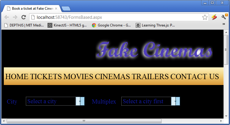
After you have selected Delhi and Delhi Nagar 1 the movies with their posters and show times are shown. Example screenshot follow below:
 How to work with Sessions in the New Forms Based System:
The following is a guide in how to do it in ASP.NET. Essentially in the web page which has your HTML and Javascript you override the render method and make a call to the static method
CanvasControlLibrary.StartSession passing in the
HtmlTextWriter. What this will do is hook you up with a session object. Then your ajax callback ASPX page for example I am going to use the simple ClickMe function and change it to simply check if the
CurrentSessionObj.Data object has any data if not add a key and a value which is a simple counter. If it exists increment and set the labels value to it. Now as a test you can pull up the page and hit the button and the number in the label will count up by the clicks. Pull up another page or browser and do the same and you will have different number since they are different sessions and the values are different and it will display correctly. So the following is the code for the HTML/JavaScript page in the code-behind file:
Collapse | Copy Code
using System;
using System.Collections.Generic;
using System.Linq;
using System.Web;
using System.Web.UI;
using System.Web.UI.WebControls;

public partial class _Default : System.Web.UI.Page
{
    protected void Page_Load(object sender, EventArgs e)
    {
    }

    protected override void Render(HtmlTextWriter writer)
    {
        base.Render(writer);
        CanvasControlLibrary.StartSession(writer);
    }
}
The next code is the AJAX callback
ClickMe function in the ASPX file:
Collapse | Copy Code
public void ClickMe(string canvasid, int windowid)
{
    CanvasControlLibrary.CCLLabelProps lp =
      ccl.getControlPropsByControlNameID("l1") as CanvasControlLibrary.CCLLabelProps;
    if (ccl.CurrentSessionObj.Data.Count == 0)
    {
        ccl.CurrentSessionObj.Data.Add("Counter", 1);
    }
    else
    {
        ccl.CurrentSessionObj.Data["Counter"] =
           (int)ccl.CurrentSessionObj.Data["Counter"] + 1;
    }
    lp.Text = ccl.CurrentSessionObj.Data["Counter"].ToString();
}
This technique is a substitute if you want to use it for the normal ASP.NET sessions as it is lighter and much faster. For PHP just use regular PHP sessions which supports AJAX calls as PHP does not support global vars which will stick due to the nature of design of PHP which makes a separate process for each request.
Supports the following Browsers:
Latest version as of 12 August 2012 of Google Chrome, Safari, Opera, Firefox, SeaMonkey, Maxthon, and IE9/IE10 are supported which basically means all major browsers are supported now. For a easy visual summary the icons of the supported browsers is shown below:

There is support for iPad, iPhone, and iPod now.
For IE9 to work you have to include the following meta tag in your web page HTML:
Collapse | Copy Code
<meta http-equiv="X-UA-Compatible" content="chrome=1, IE=edge" />
Note to Readers:
I am continuously working on this so please keep checking up on the article or subscribe to it. There is going to be a lot more. Also as it is very hard work I would appreciate positive comments if you like and it and use it as it is free to use without any warranty or liability on my behalf. If you have any questions regarding how to do something custom which is not provided please email me at akshay.srin@gmail.com and I will answer as soon as I read it. Hope you enjoy the work and build better looking and fancier web pages with it and make bring a better web browsing experience to you and me and all the world.
Download Canvas Control Library - 1.4 MB 